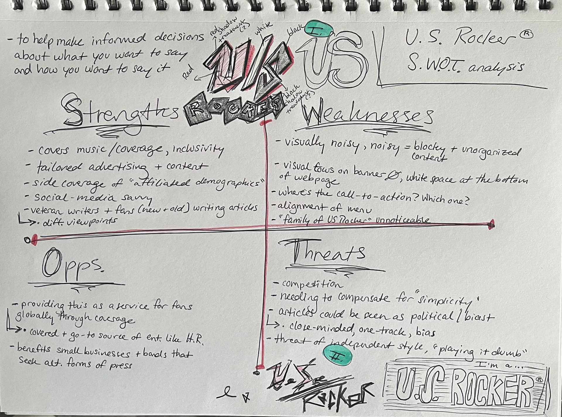
We updated the brand identity with a value system, multiple S.W.O.T. analyses, a value proposition, and looking through to the brand identifiers for the brand associations. Finalising these parts, we were able to design the core visuals, colors and chosen typefaces to best represent the U.S. Rocker name.

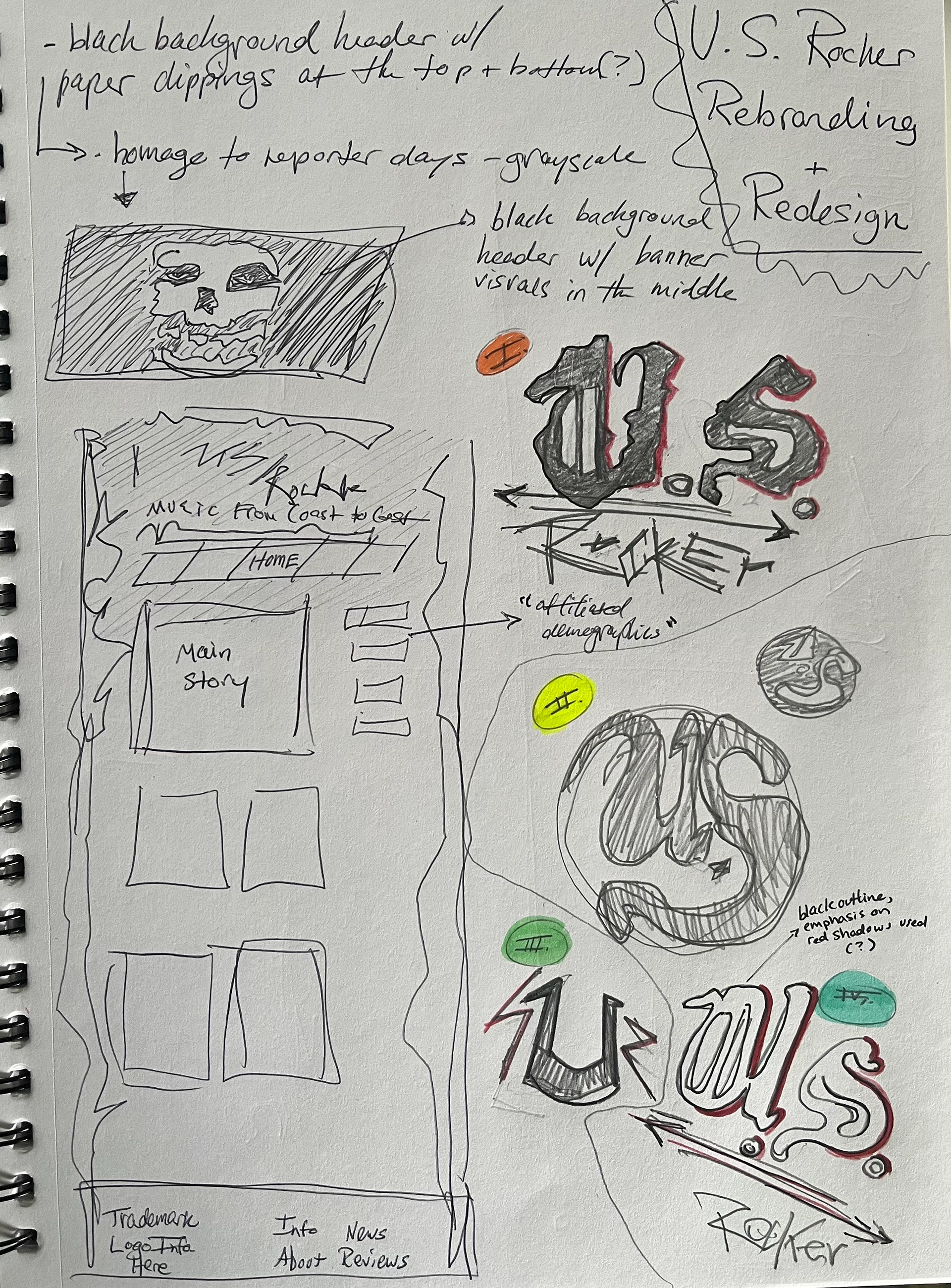
Rough drafts, analyses and sketches:

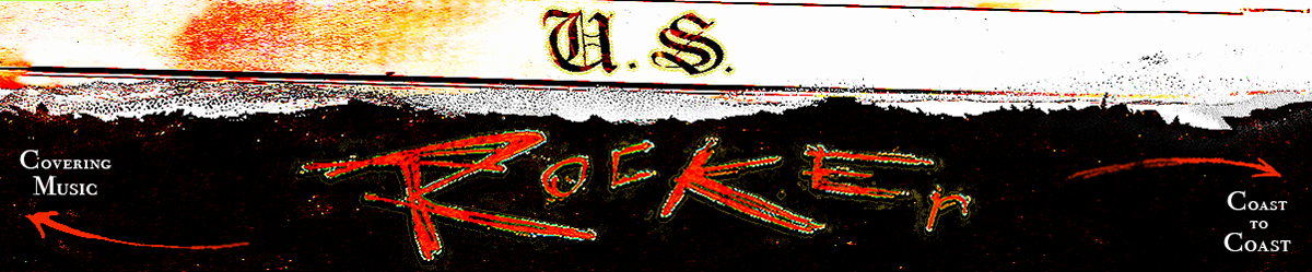
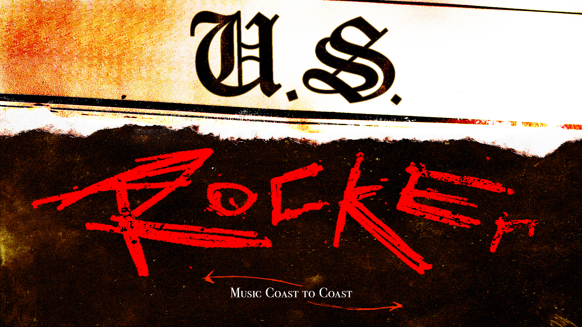
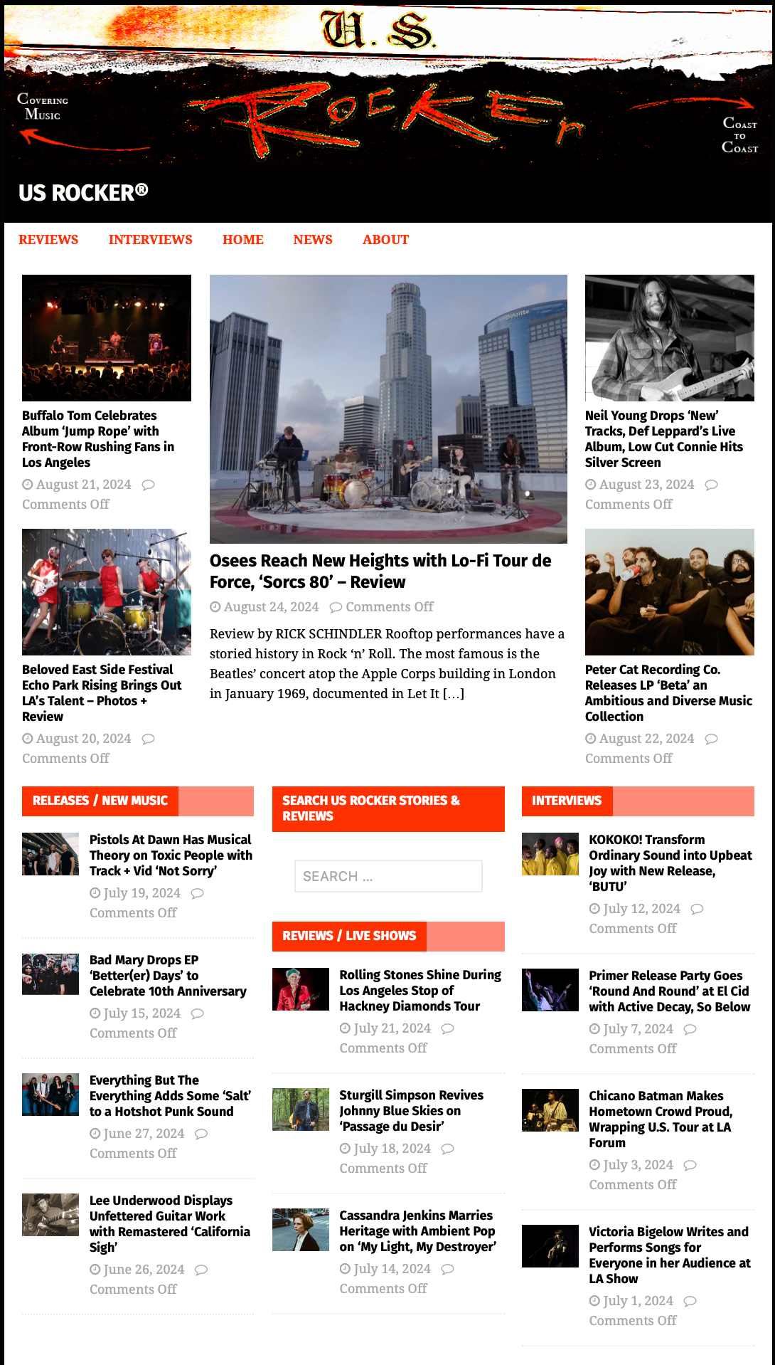
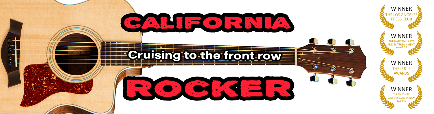
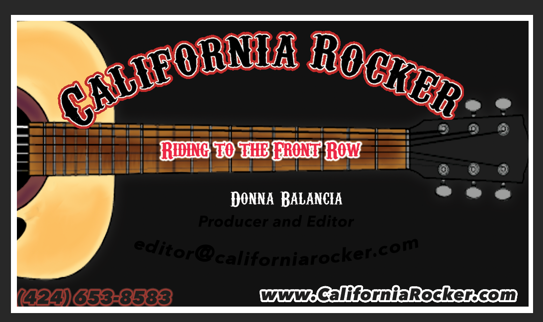
Website header & business card design, 2020:
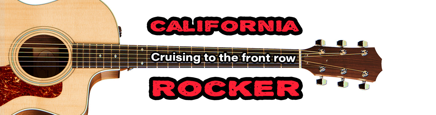


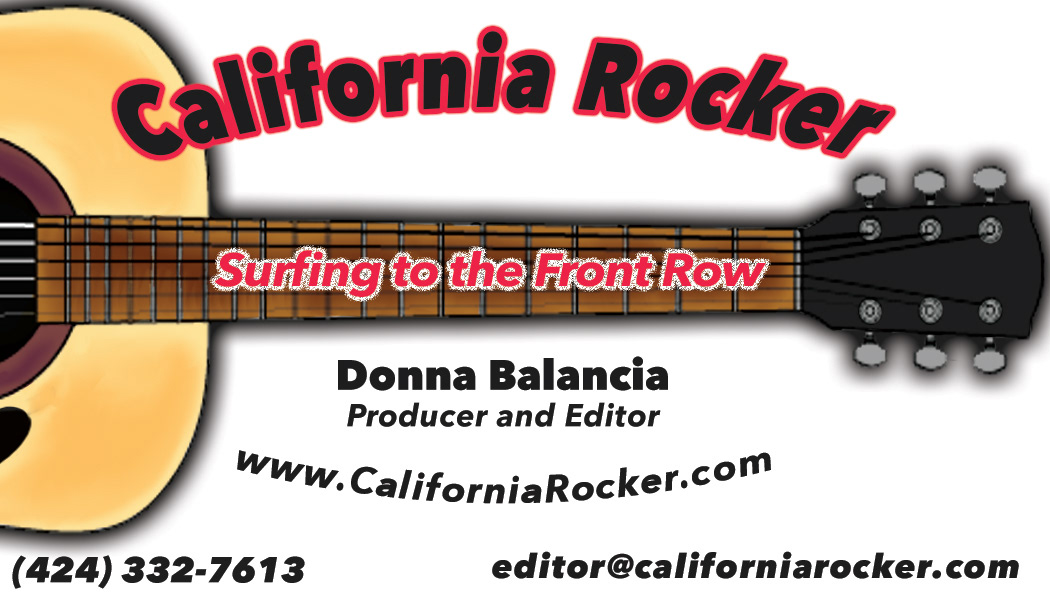
Website header & business card design, 2014:
•
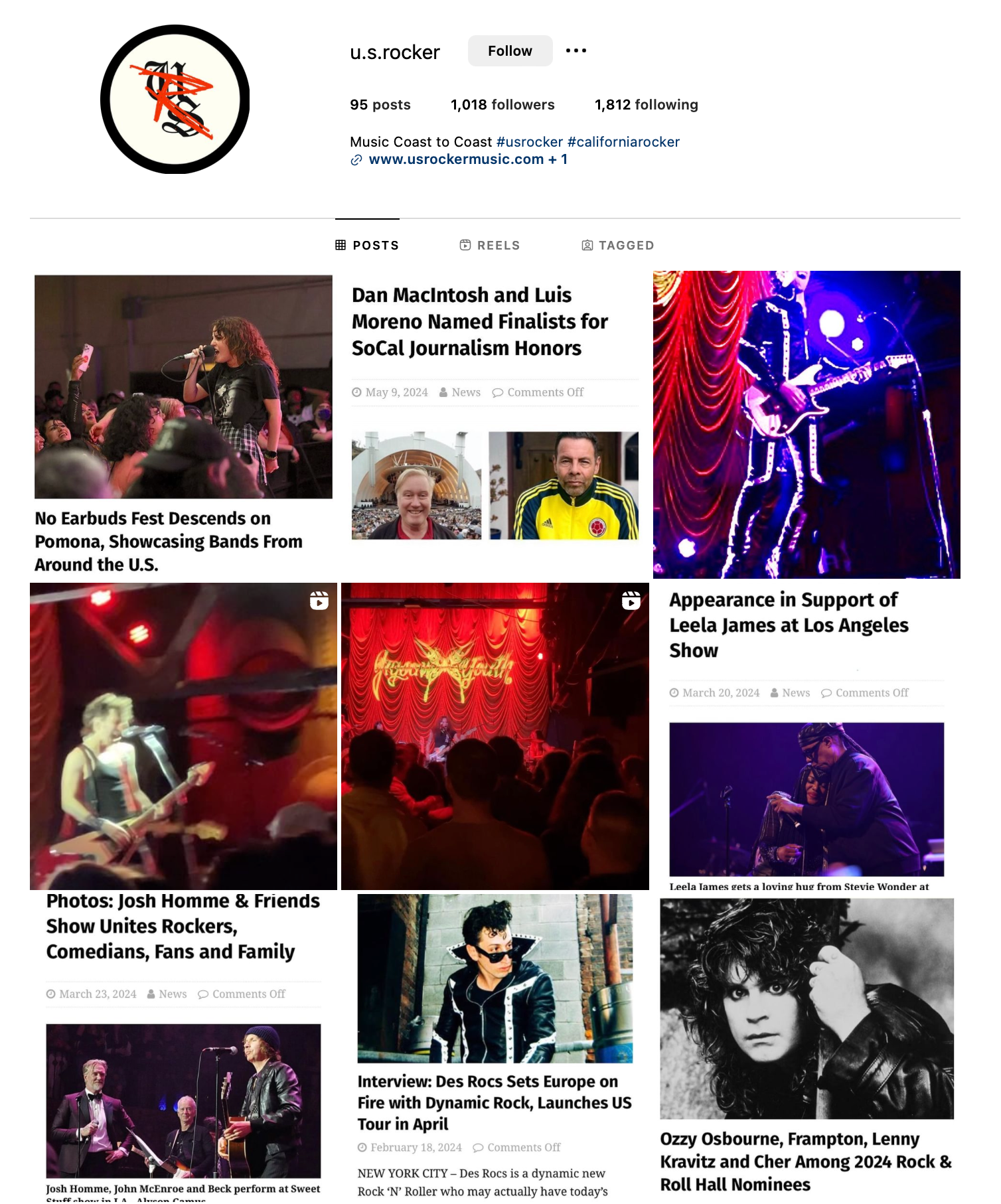
Brand identity development & core visuals made for U.S. Rocker, a magazine that caters to a punk & rock niche, covering shows for fans unable to physically attend. Given the owner's background, I felt inspired to mix her journalism career with the rebranding of the online magazine. We created an identity reflecting both U.S. Rocker's values while enhancing engagement with both existing and potential readers across its coast-to-coast coverage. Pinches of inspiration came from mid to late 90s newspapers, alias-edges, and over-saturated color schemes, creating a gritty, rock & roll aesthetic. This cohesive visual system effectively communicates the magazine's unique position in music journalism, bridging the gap between contemporary rebellion and print nostalgia.