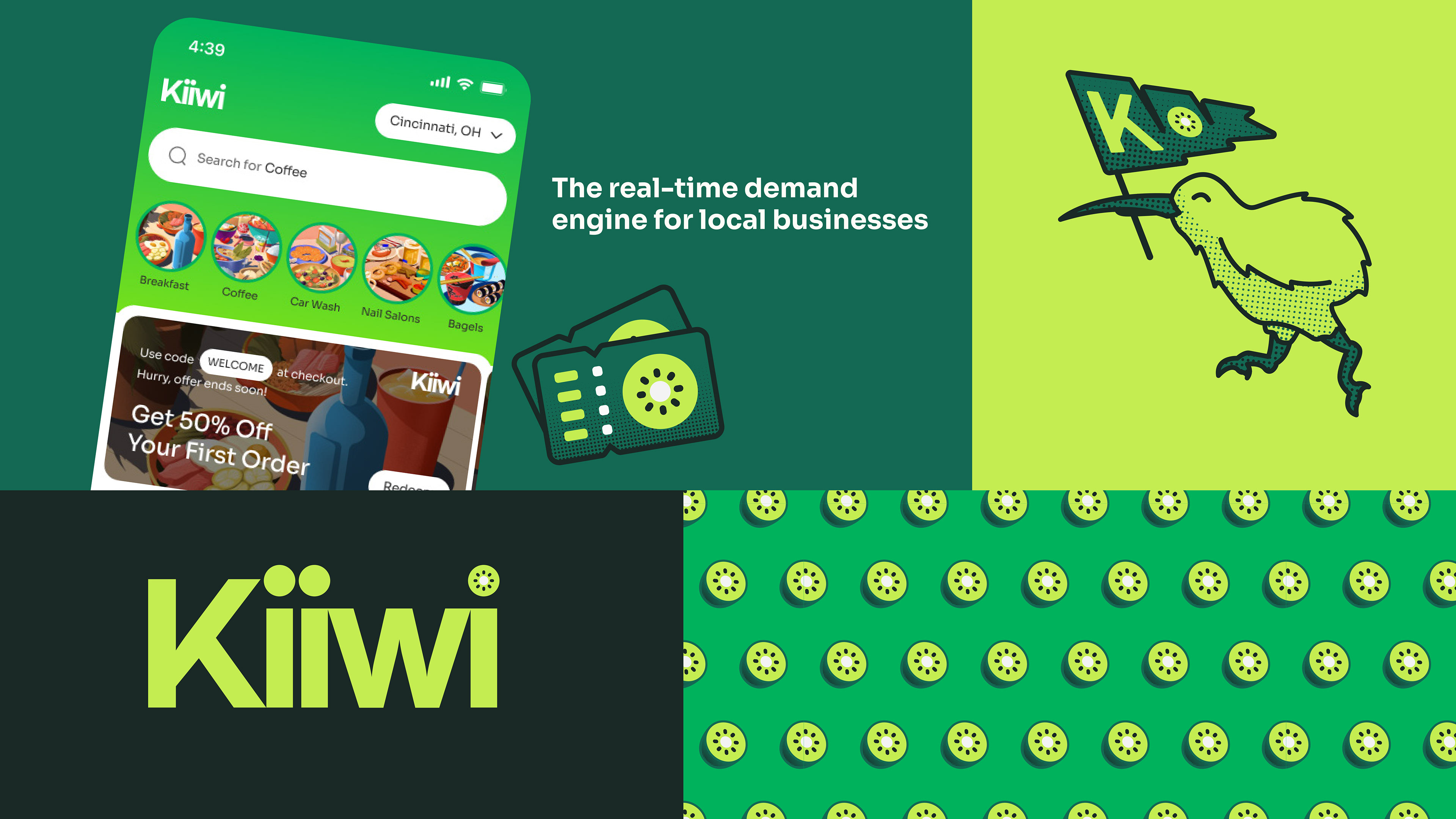
Final design:
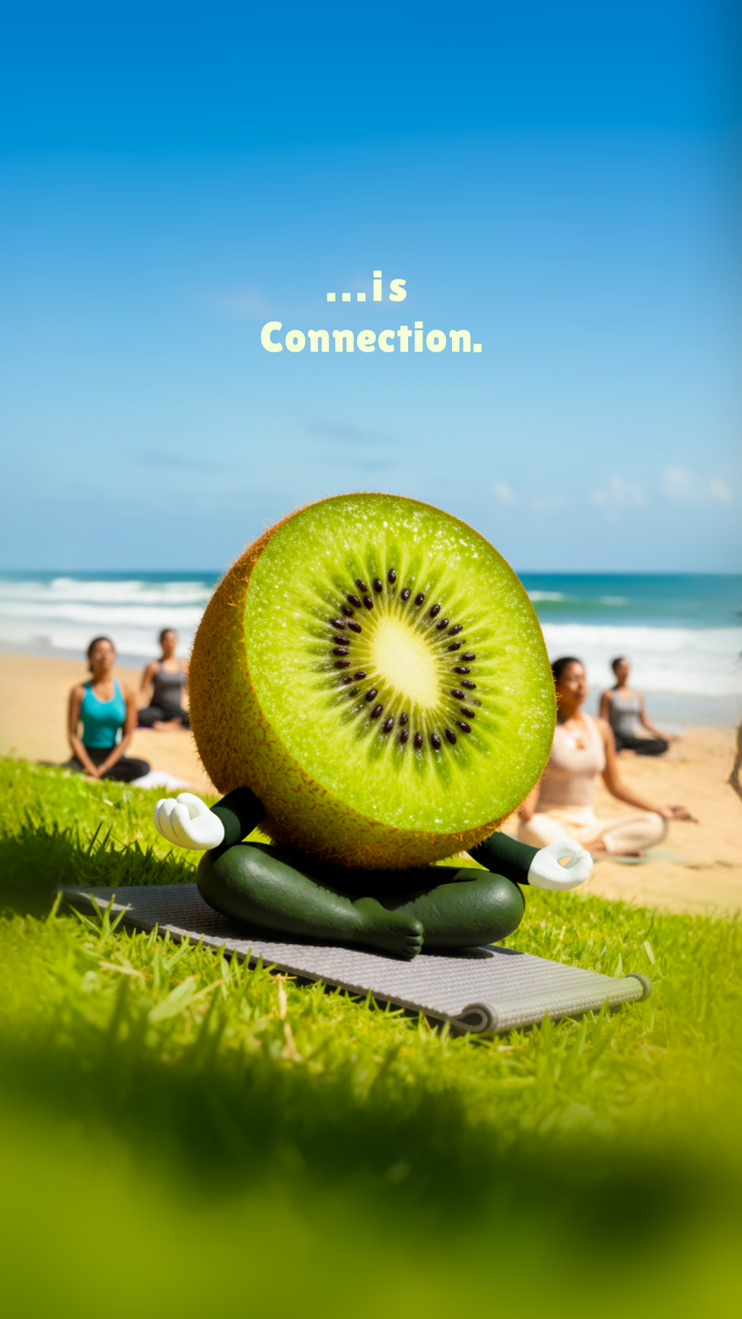
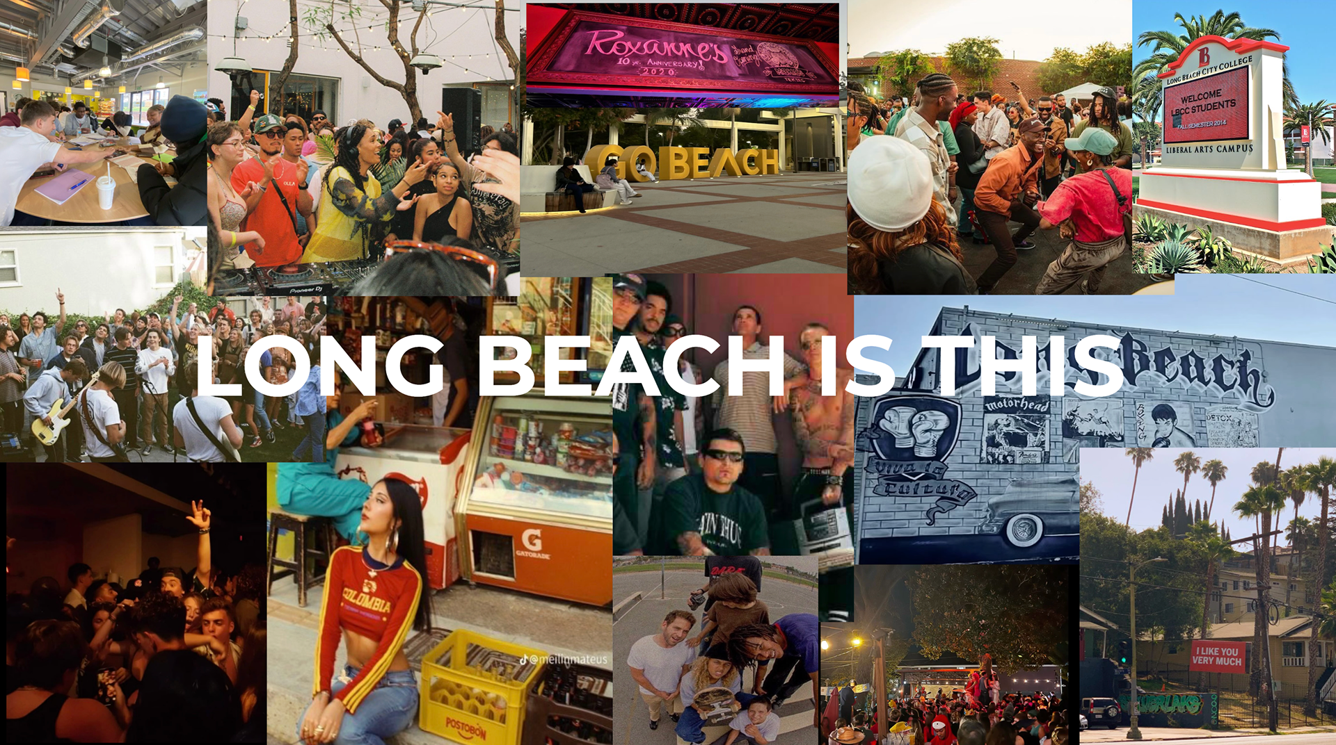
Kiiwi is...Connection.
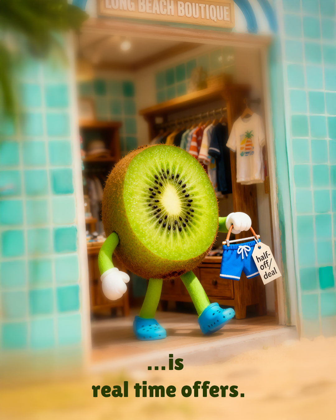
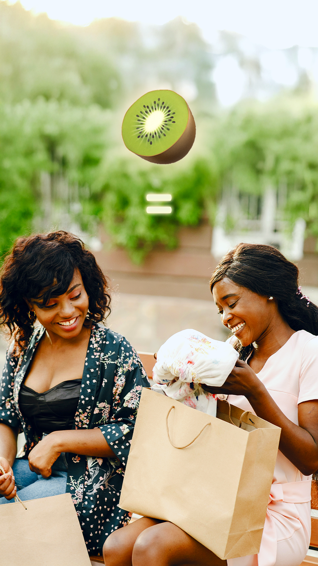
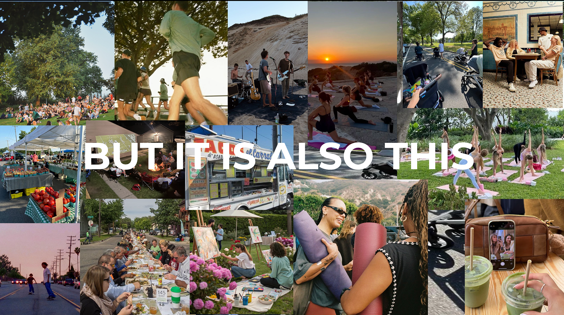
Kiiwi is...real time offers.
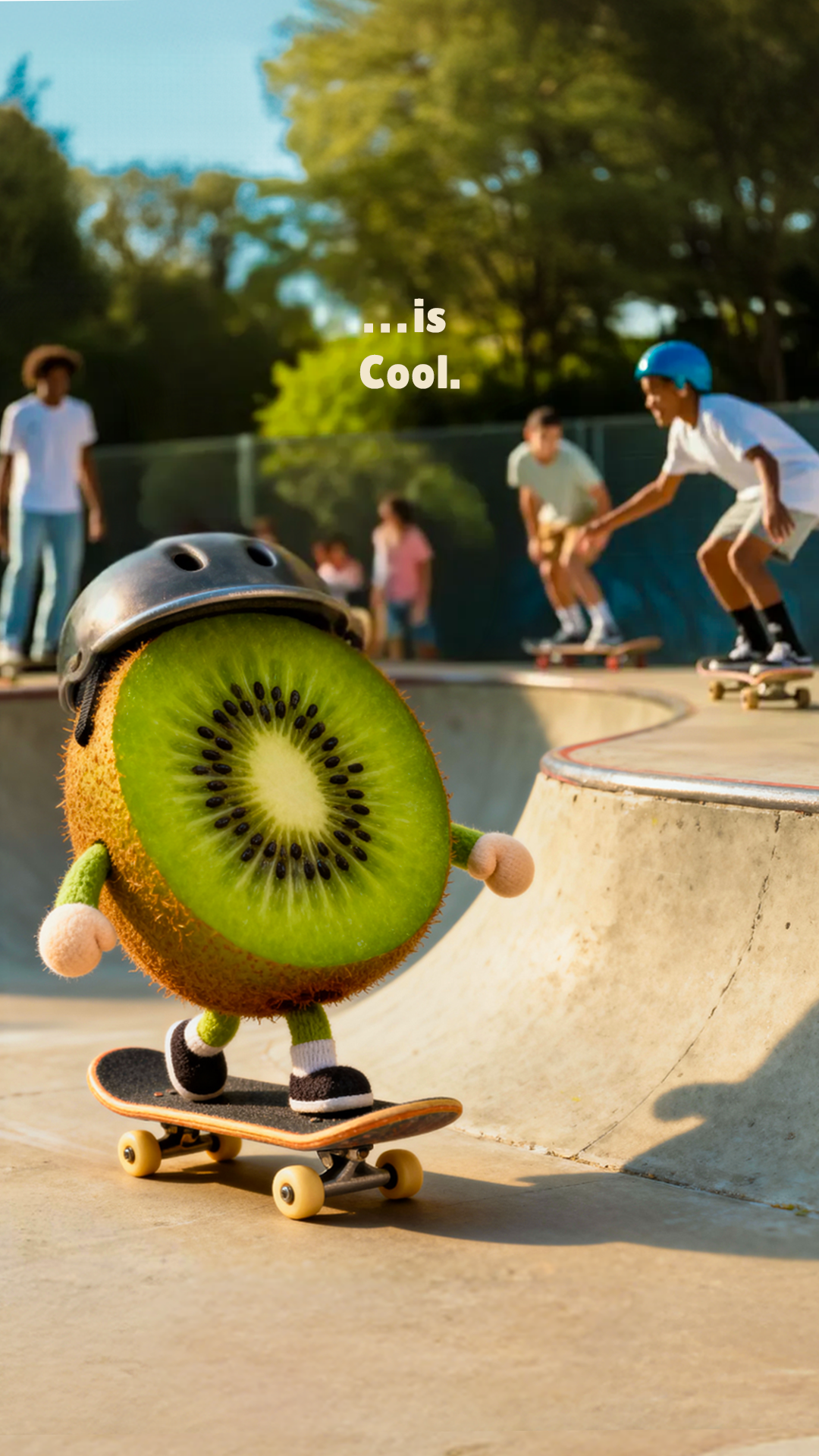
Kiiwi is...Cool.
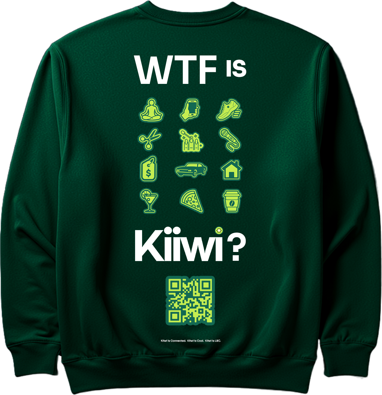
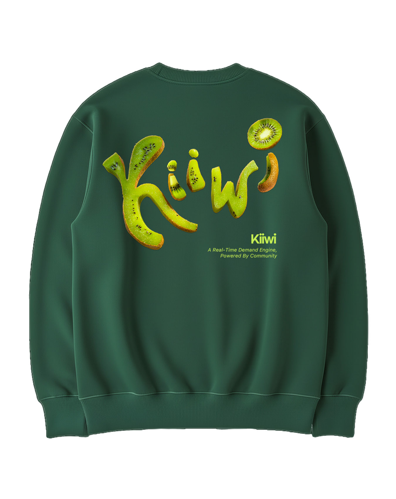
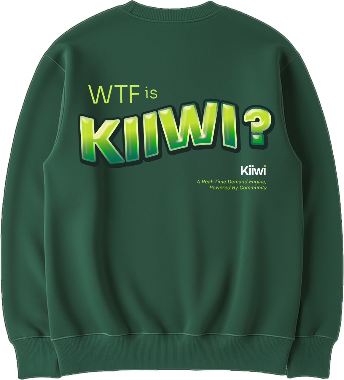
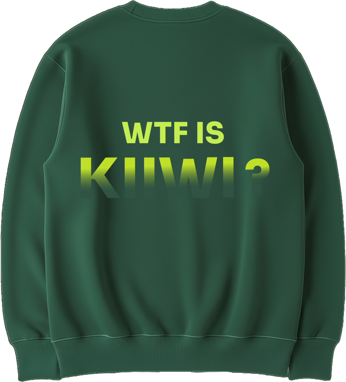
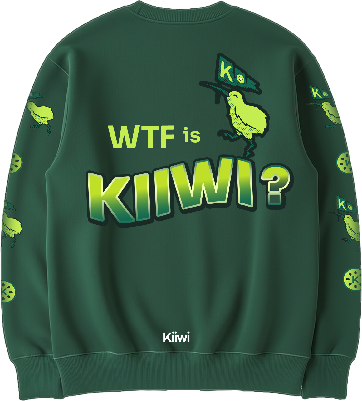
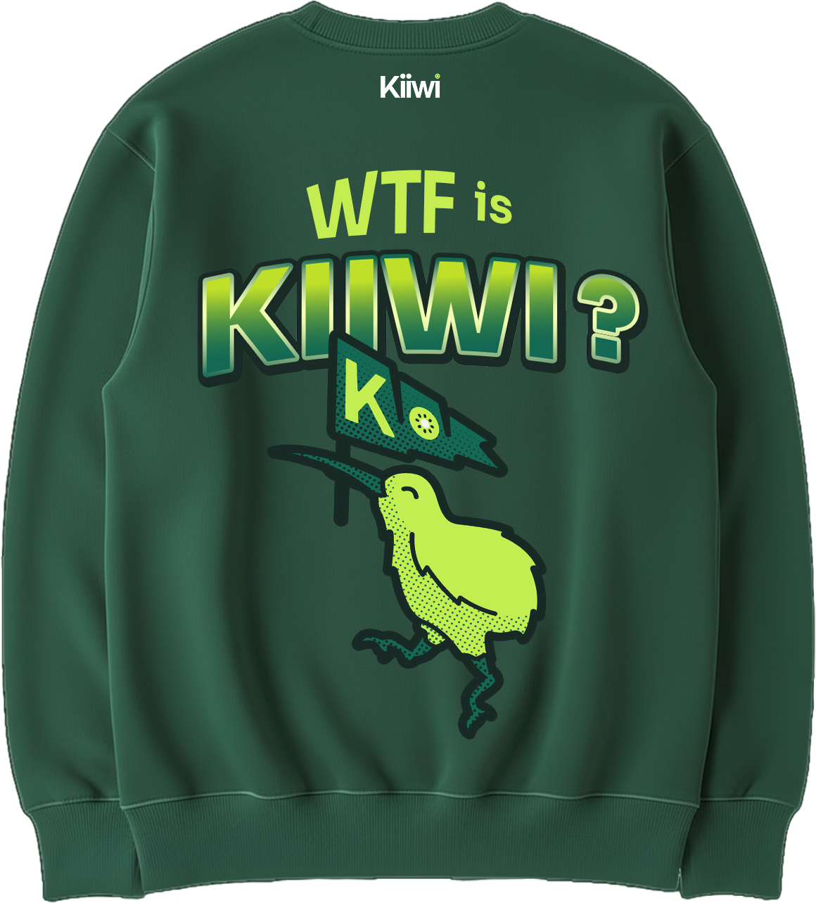
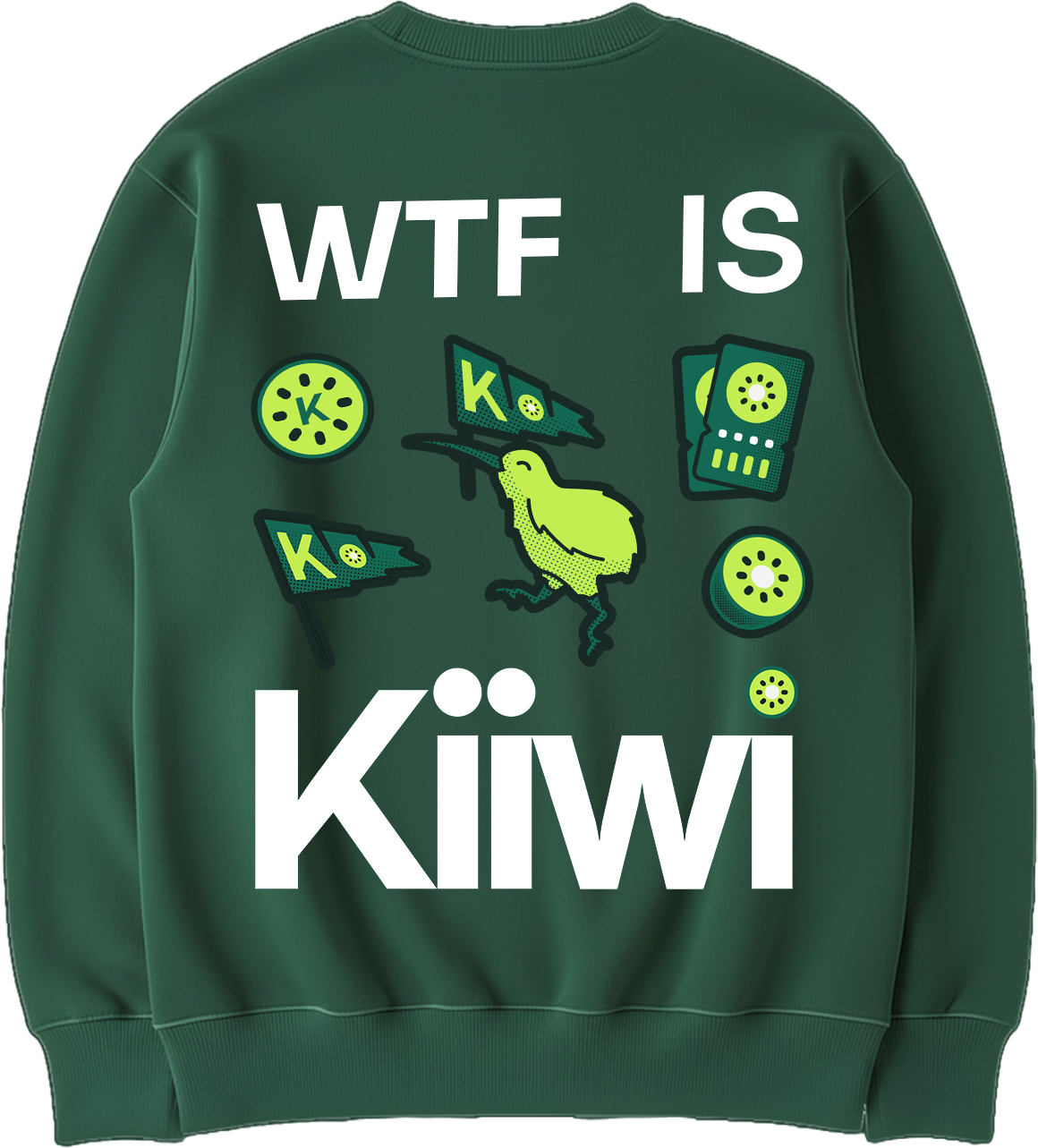
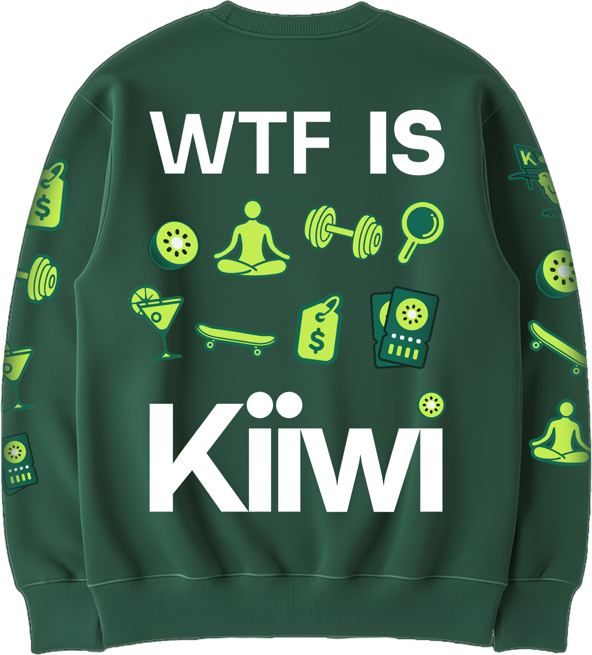
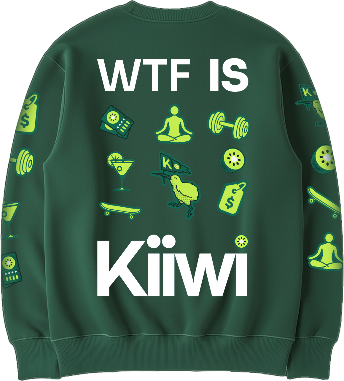
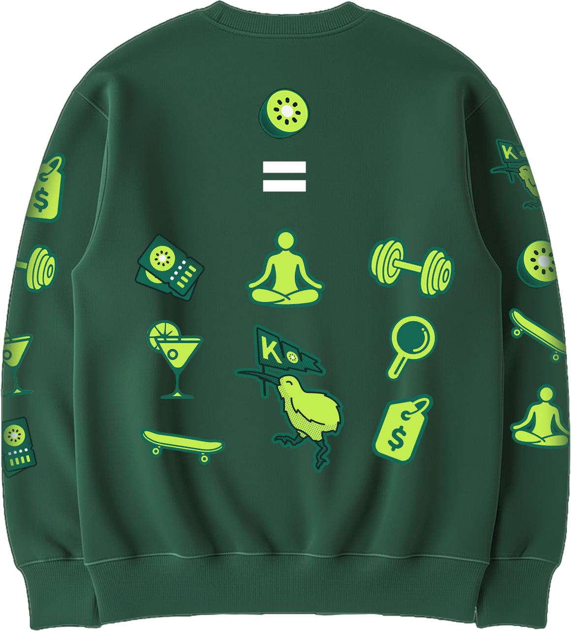
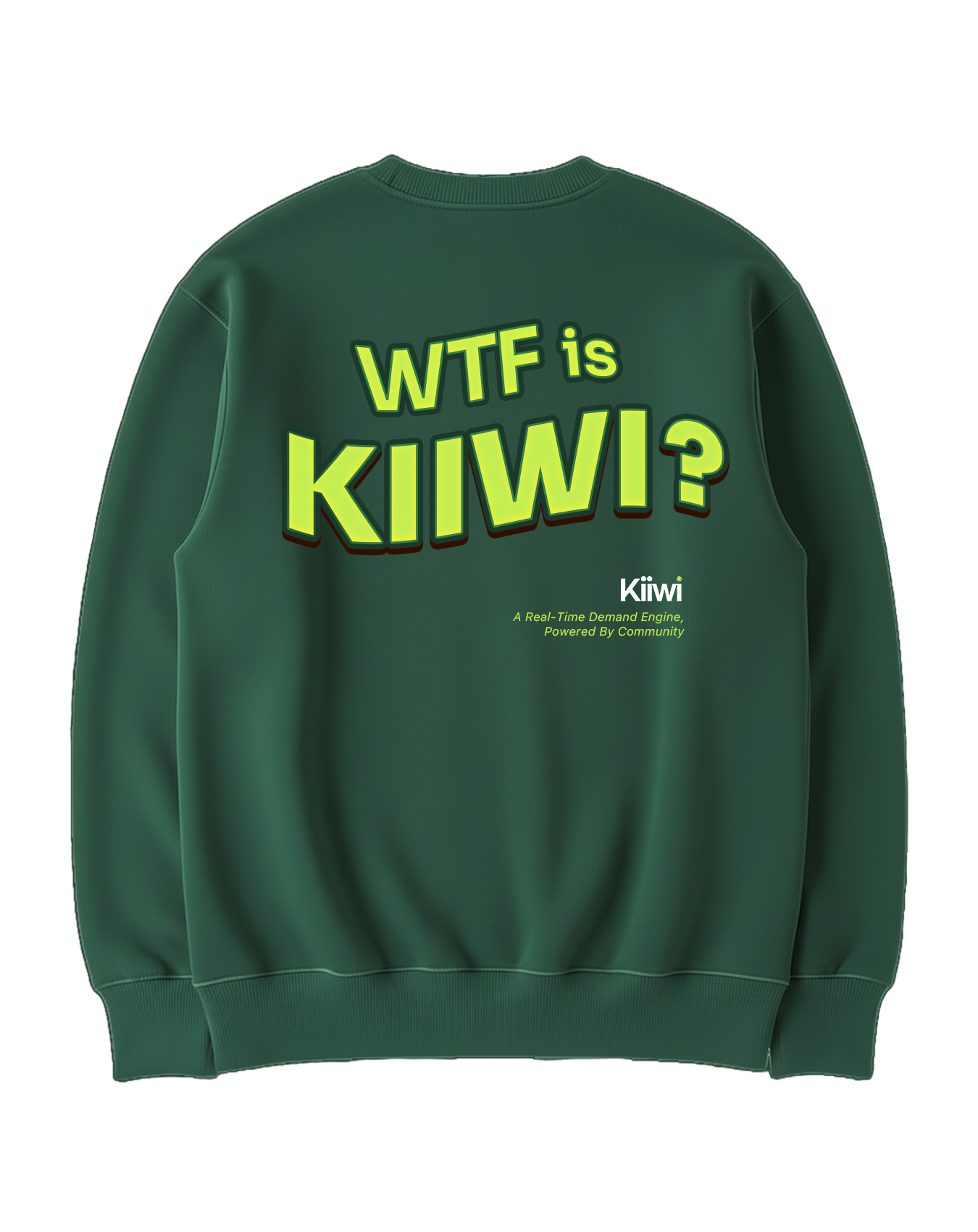
Back of Kiiwi Internal Stakeholders team apparel.
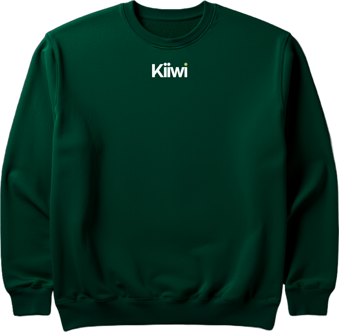
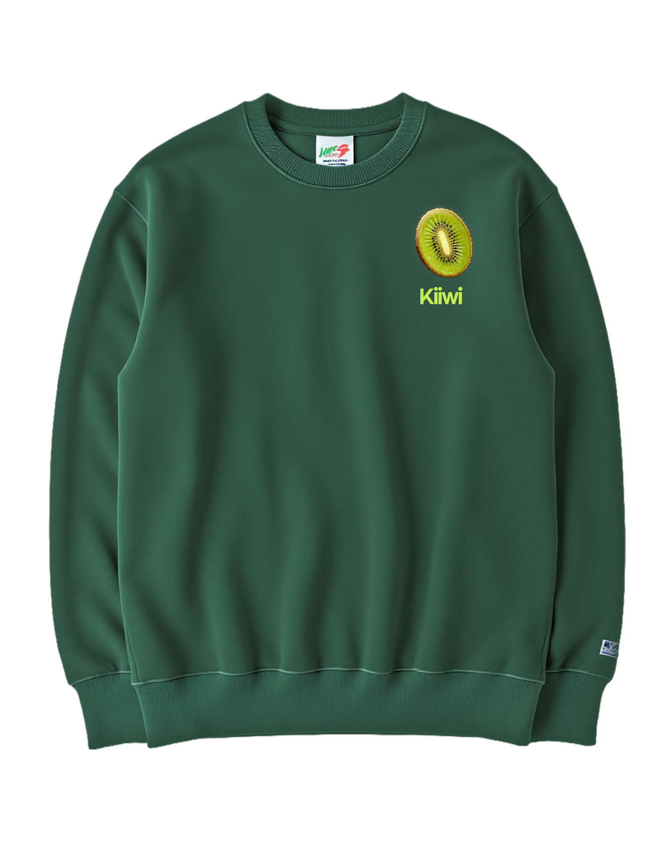
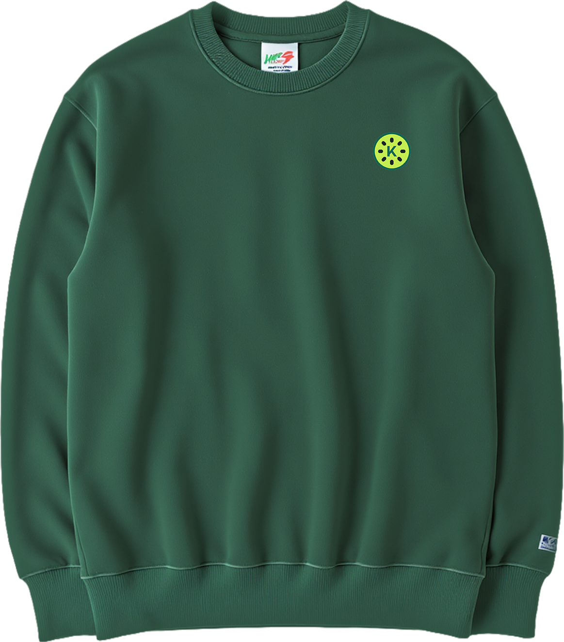
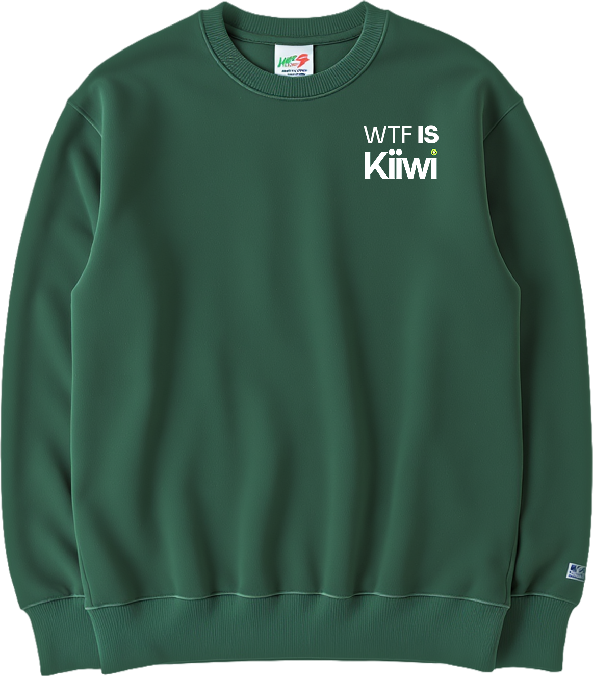
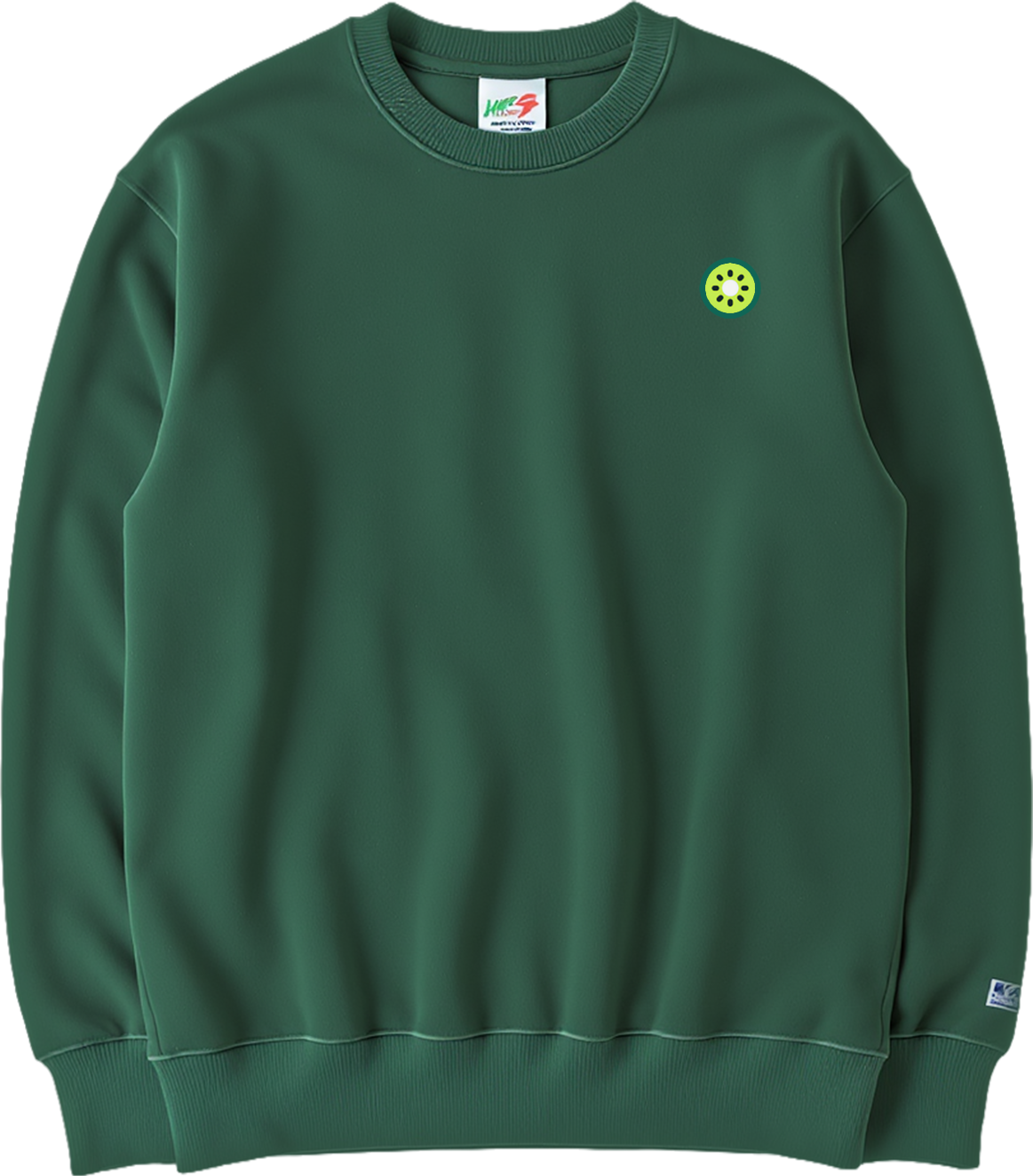
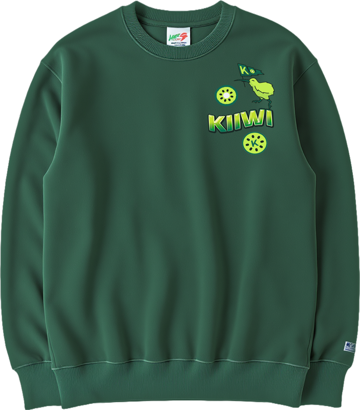
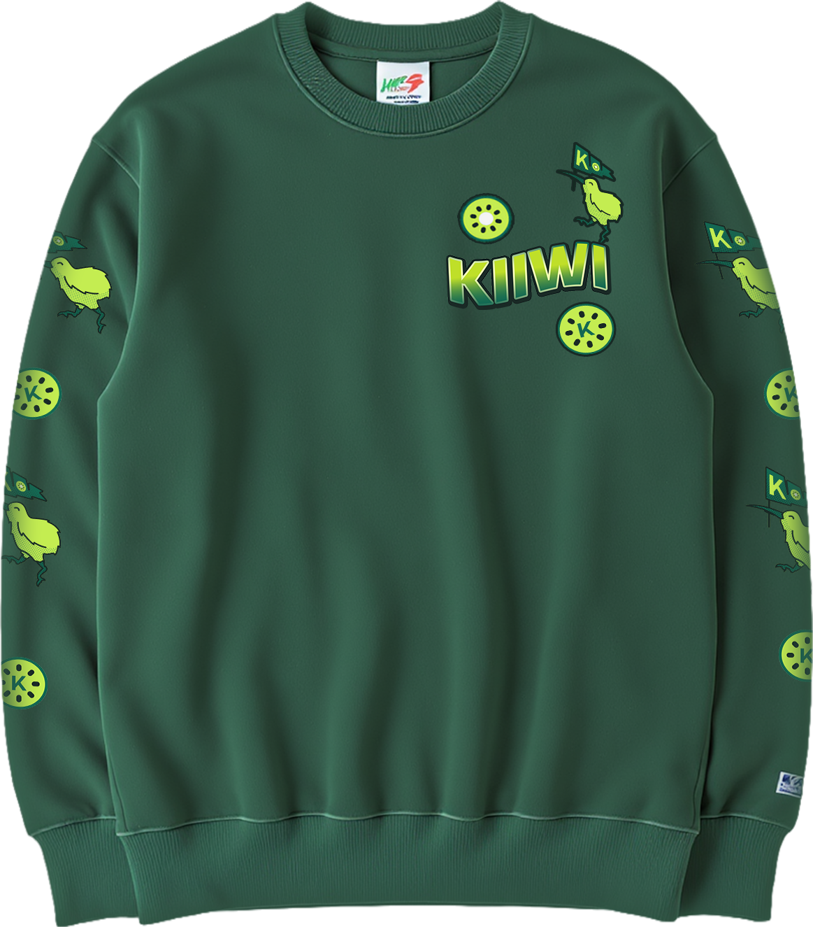
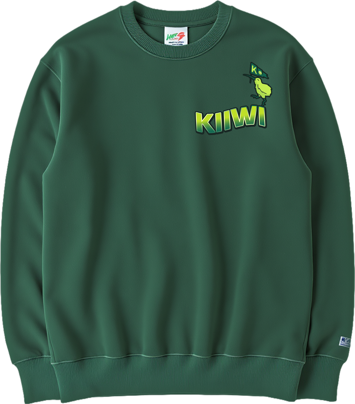
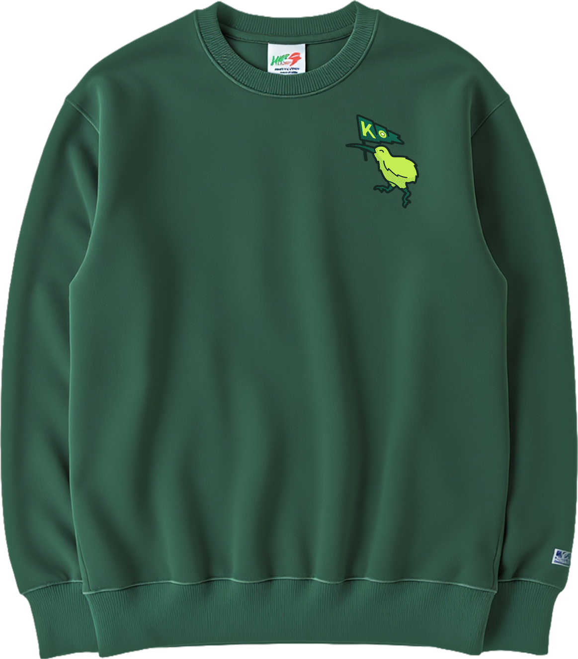
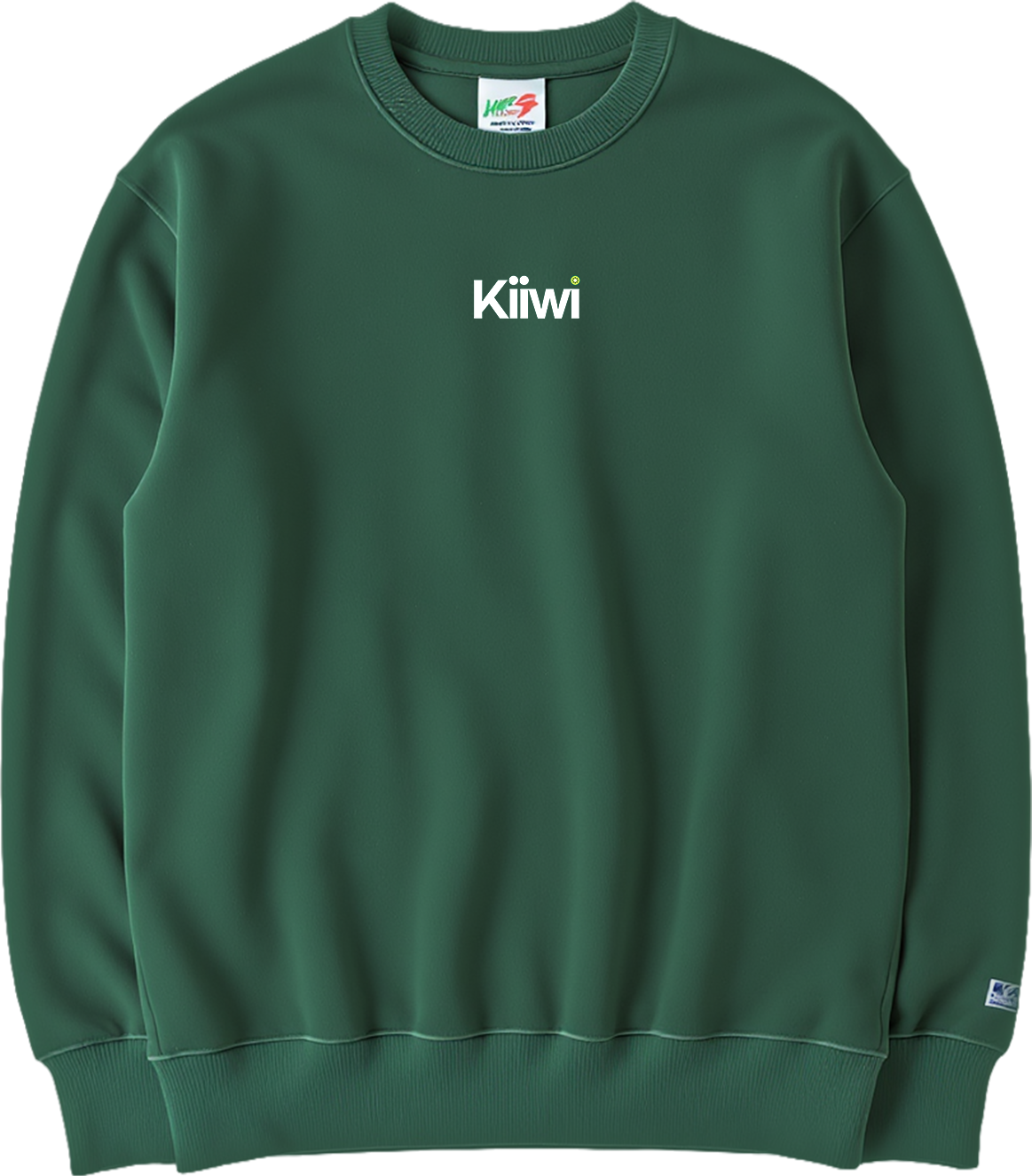
Front of Kiiwi Internal Stakeholders team apparel.
Work in Progress shots:


•
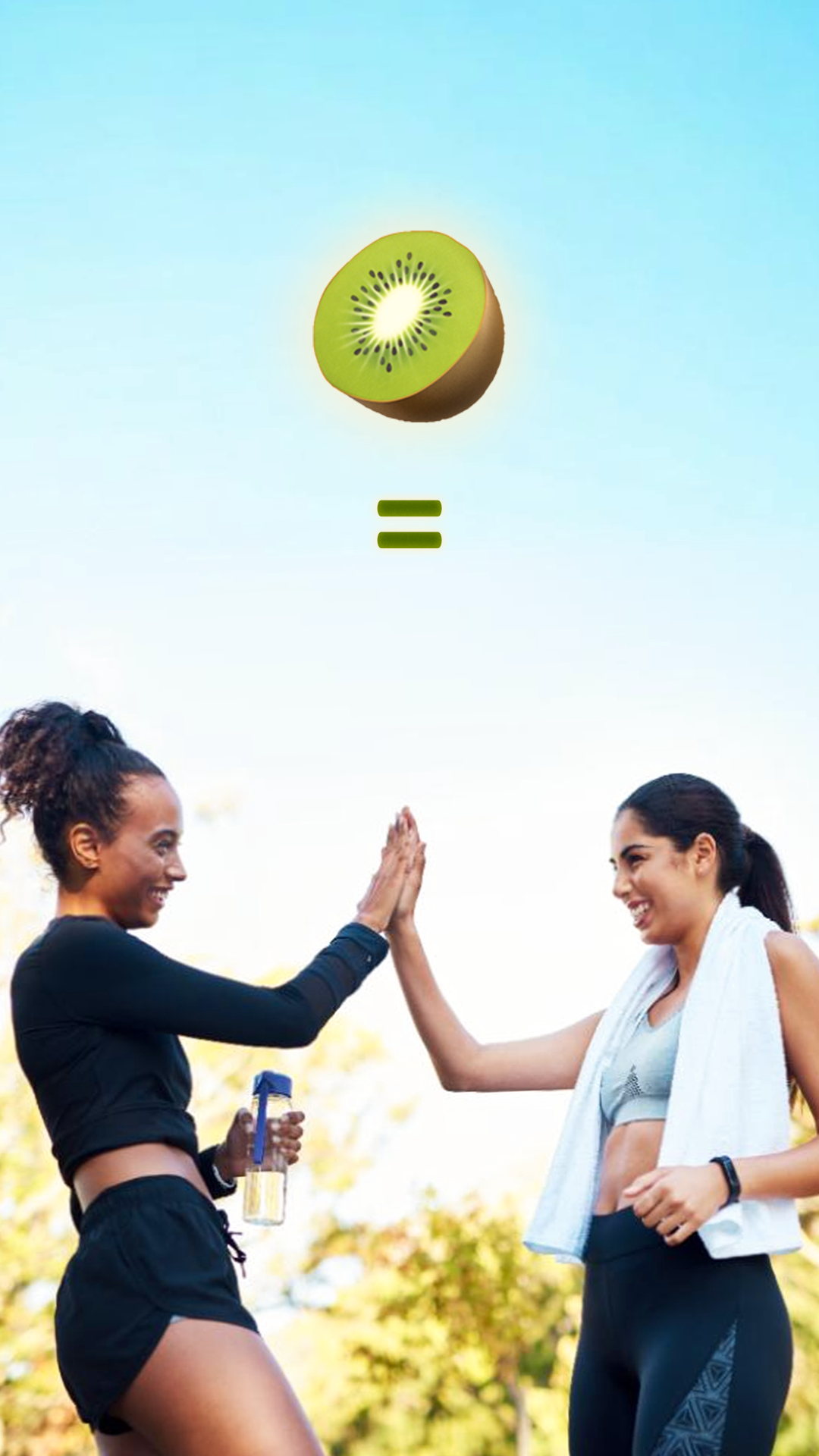
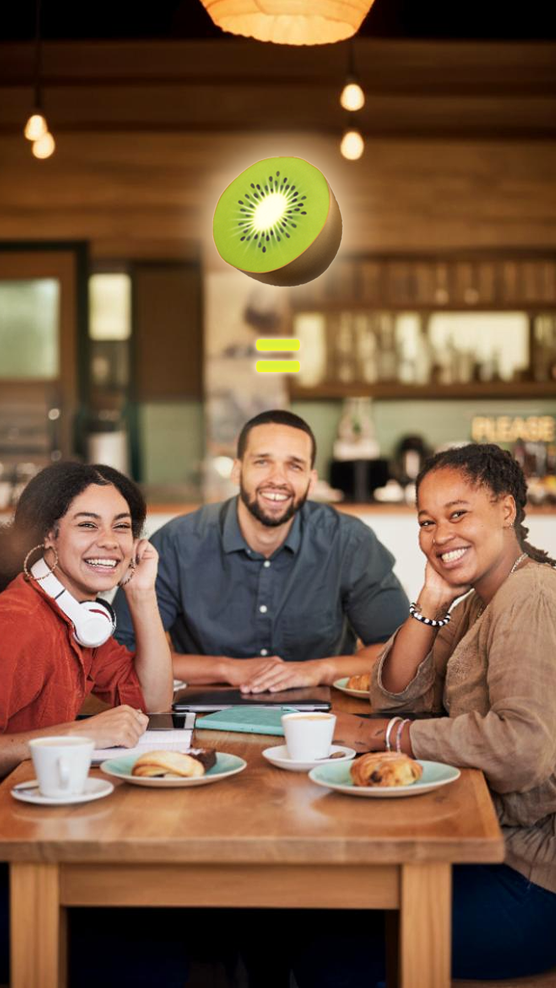
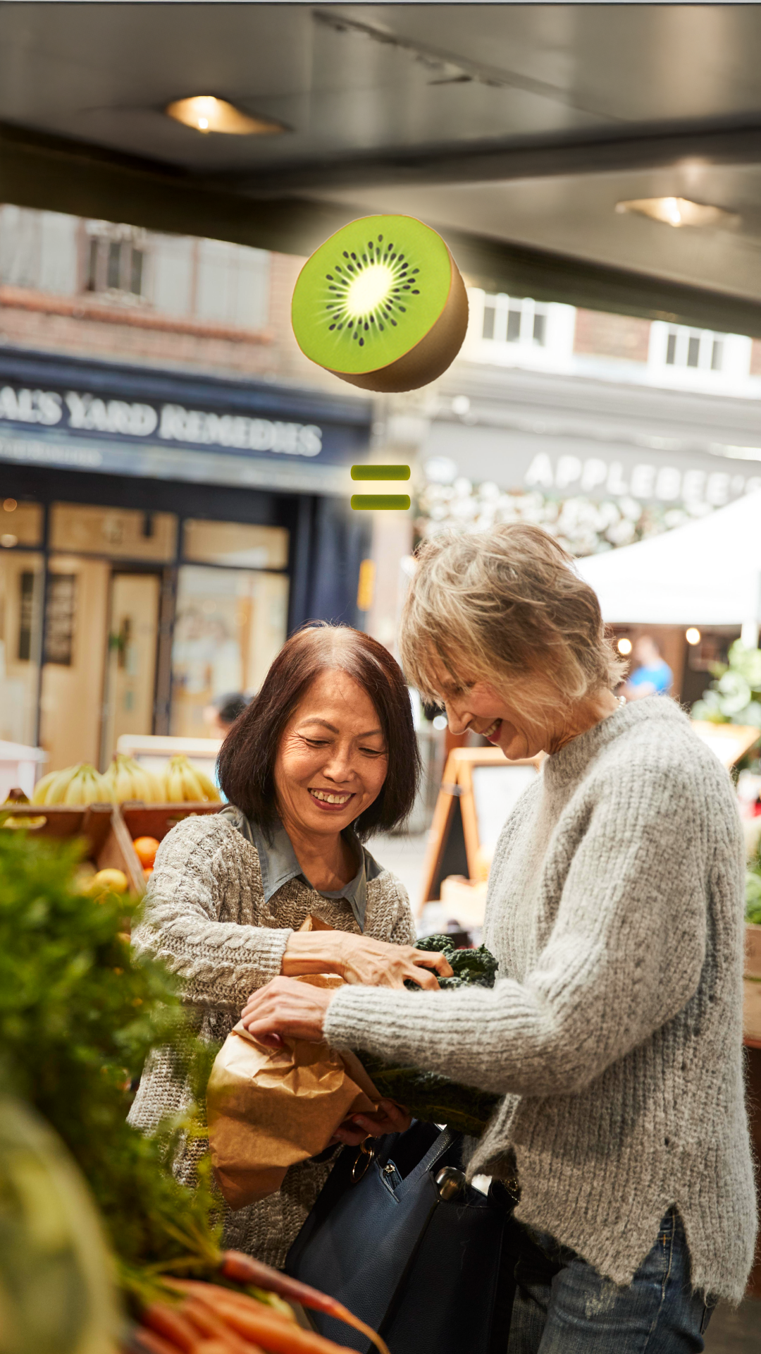
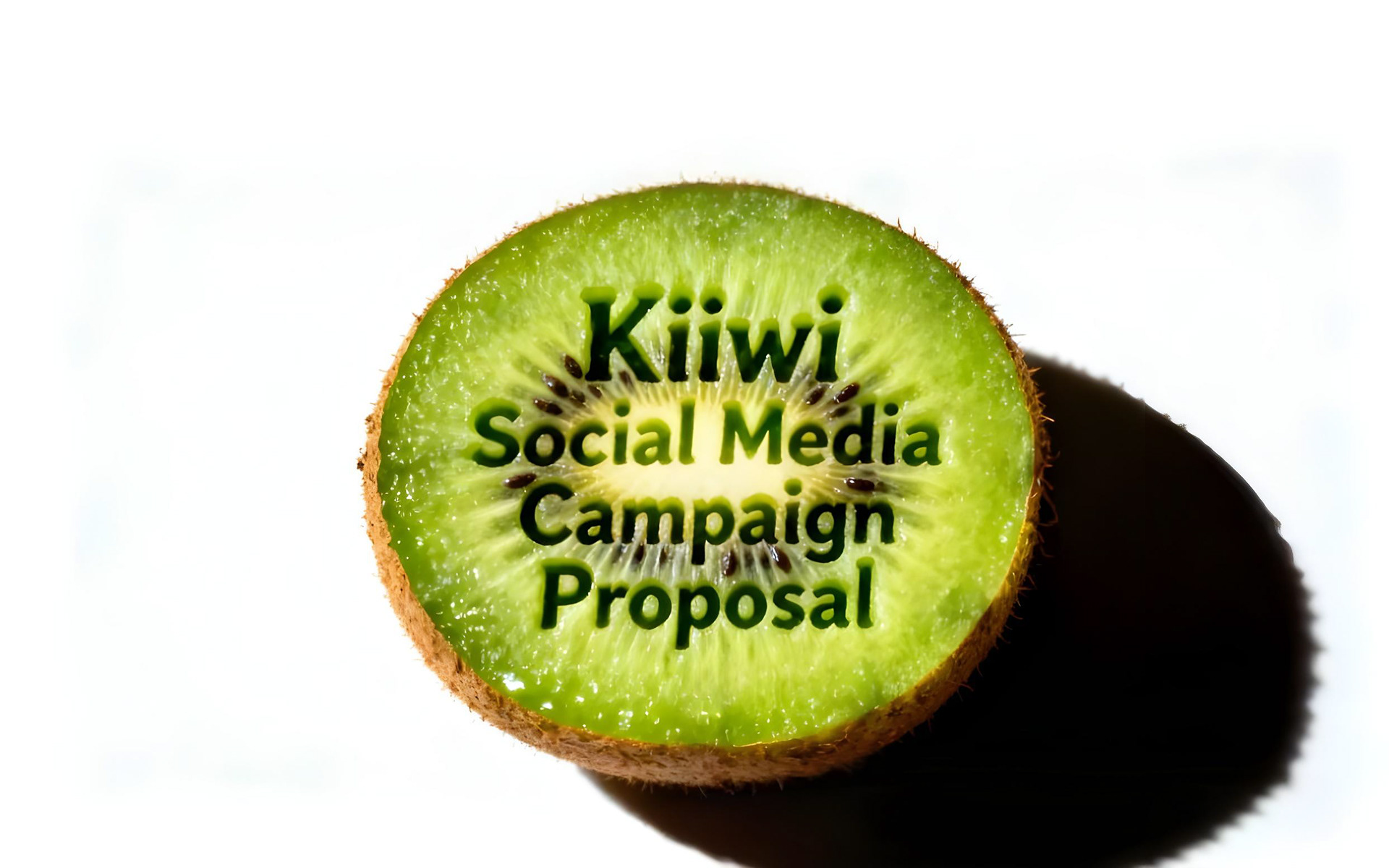
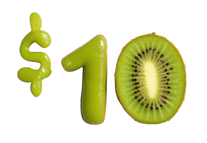
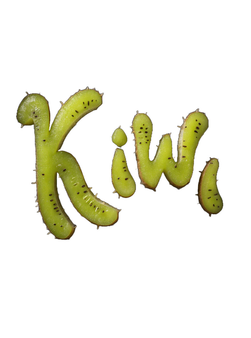
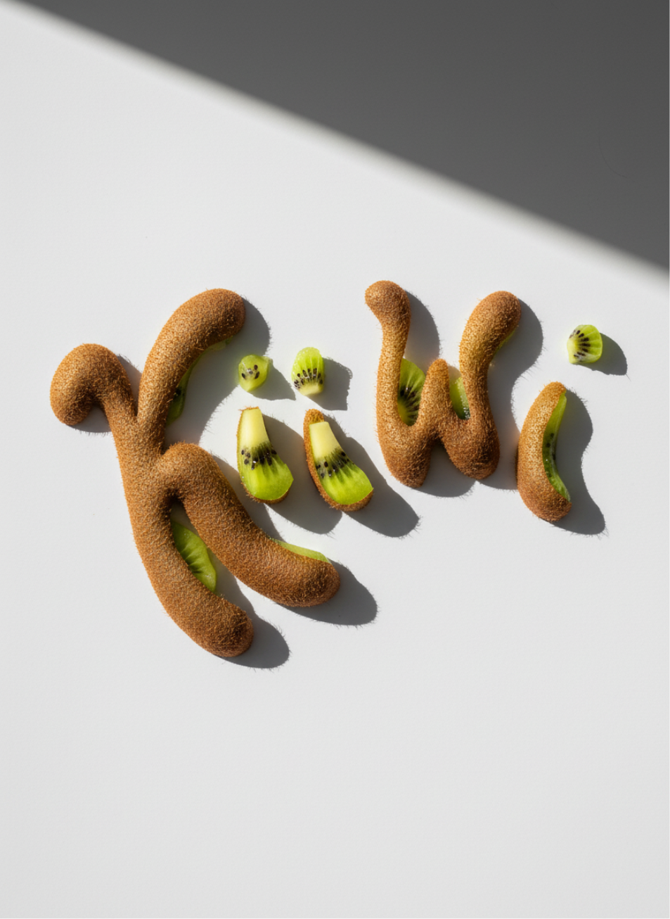
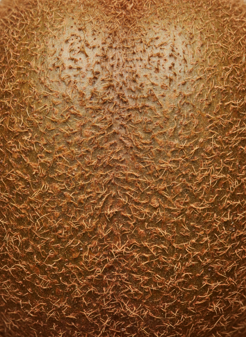
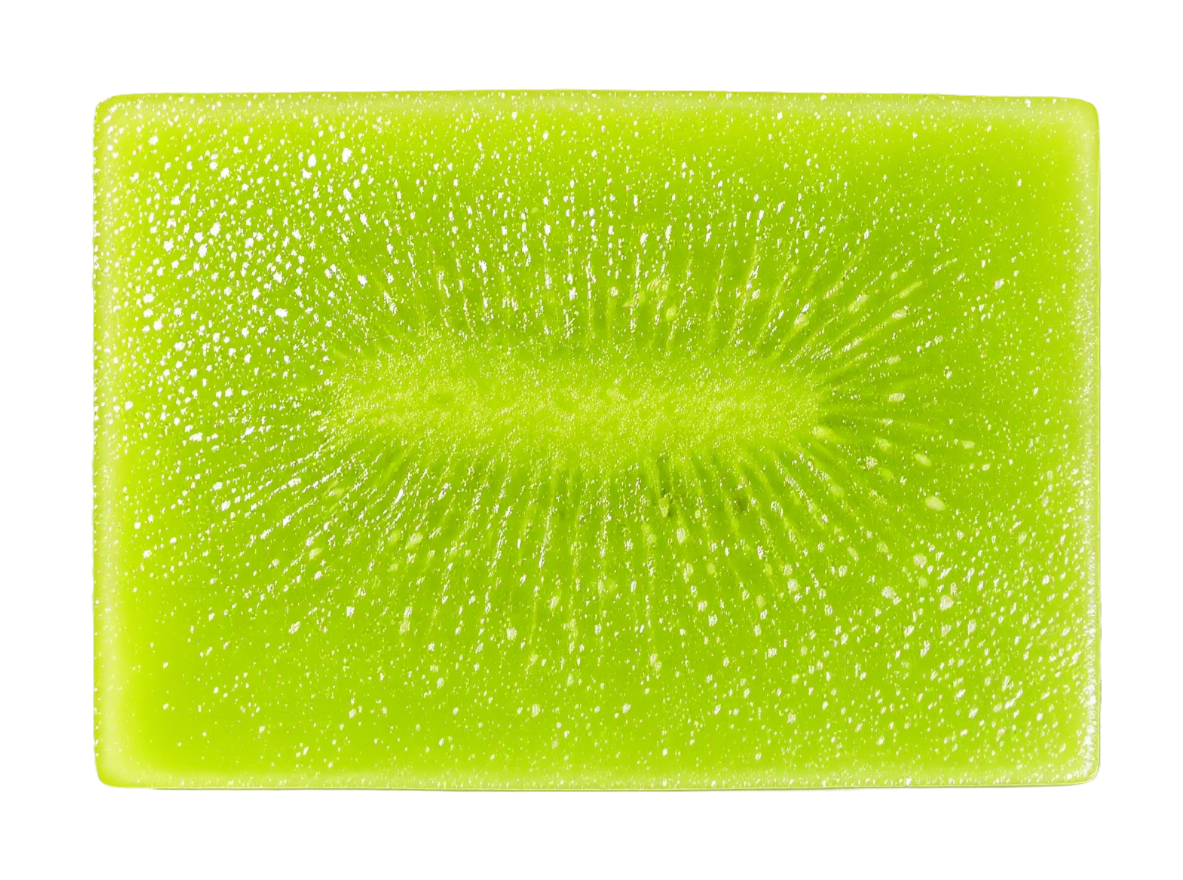
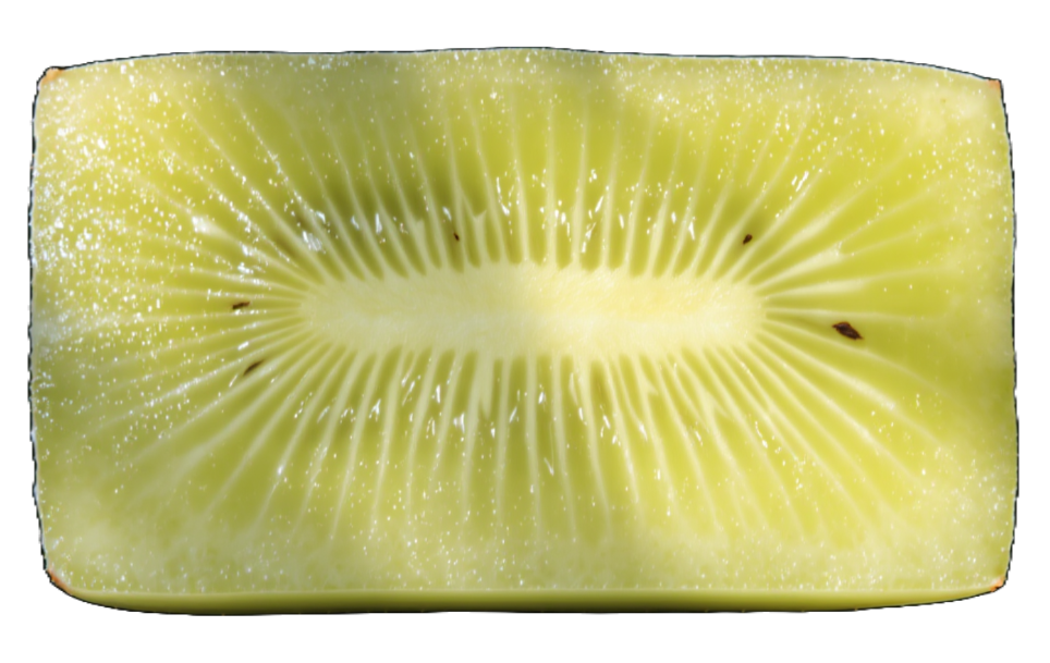
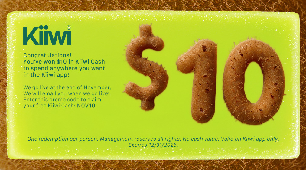
The Kiiwi character was developed as a literal kiwi fruit mascot placed in authentic Long Beach scenarios to visually answer the campaign's core question with declarations like "Kiiwi is community" and "Kiiwi is cool." The character was photographed engaging in real activities such as skateboarding at local parks, doing yoga in studios, and shopping at Long Beach boutiques, positioning the brand as active, fun, and integrated into the community's daily life. This design direction also incorporated skeuomorphic elements that mimicked real-world kiwi characteristics, including peeled skin textures, juice droplets, tactile seed patterns, macro pulp textures, and glistening gradients used as overlays, borders, and accents throughout the visual system. Typography treatments featured the word "kiwi" constructed from sliced and whole kiwi fruit, reinforcing tangibility and sensory appeal while maintaining the Vibrant Realism aesthetic.
The mascot served as a playful surprise element and visual metaphor, grounding abstract brand values in vivid, memorable imagery designed to resonate with Gen Z audiences and cut through corporate digital clutter.