Link to re-branded website:
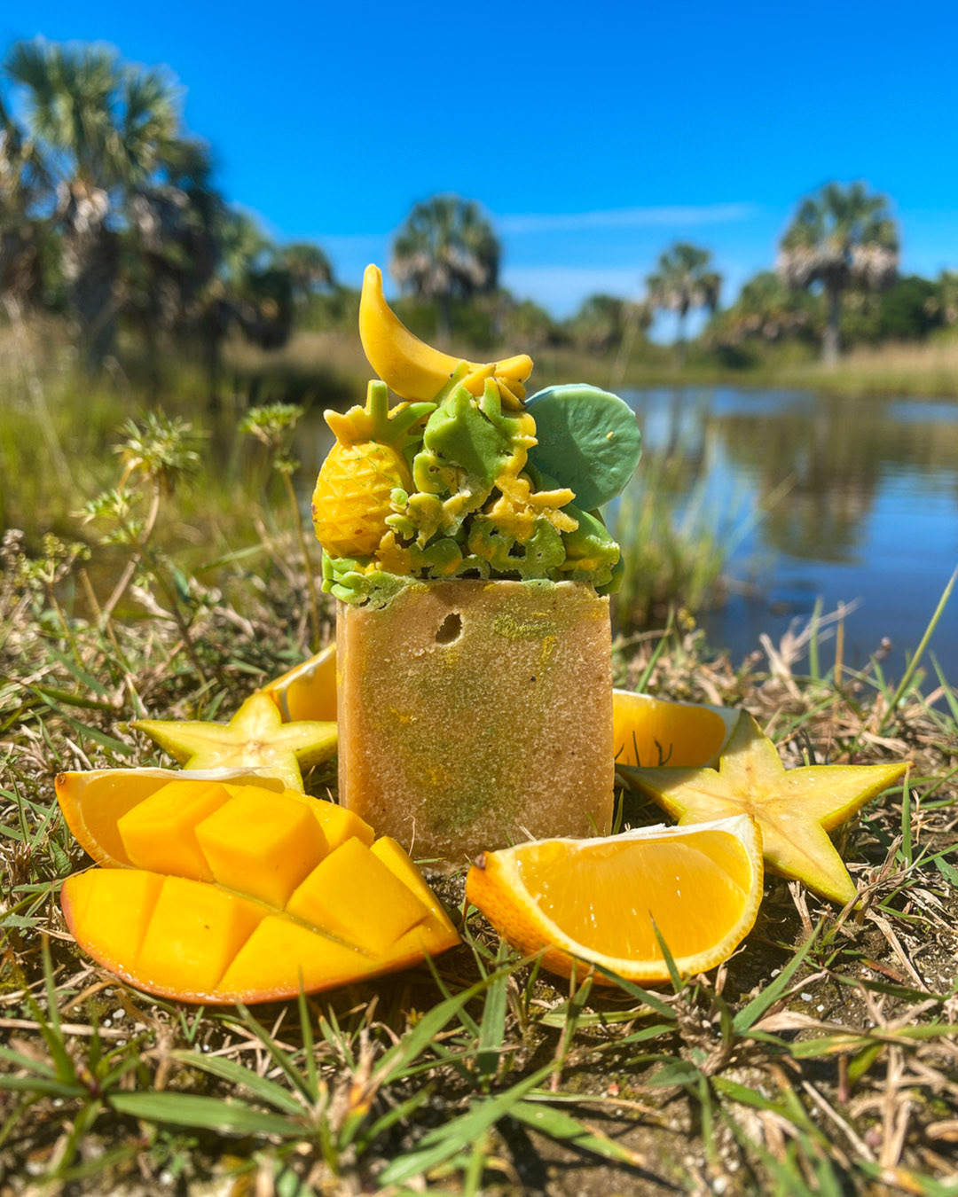
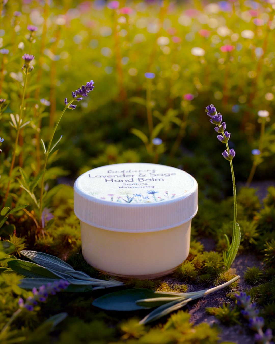
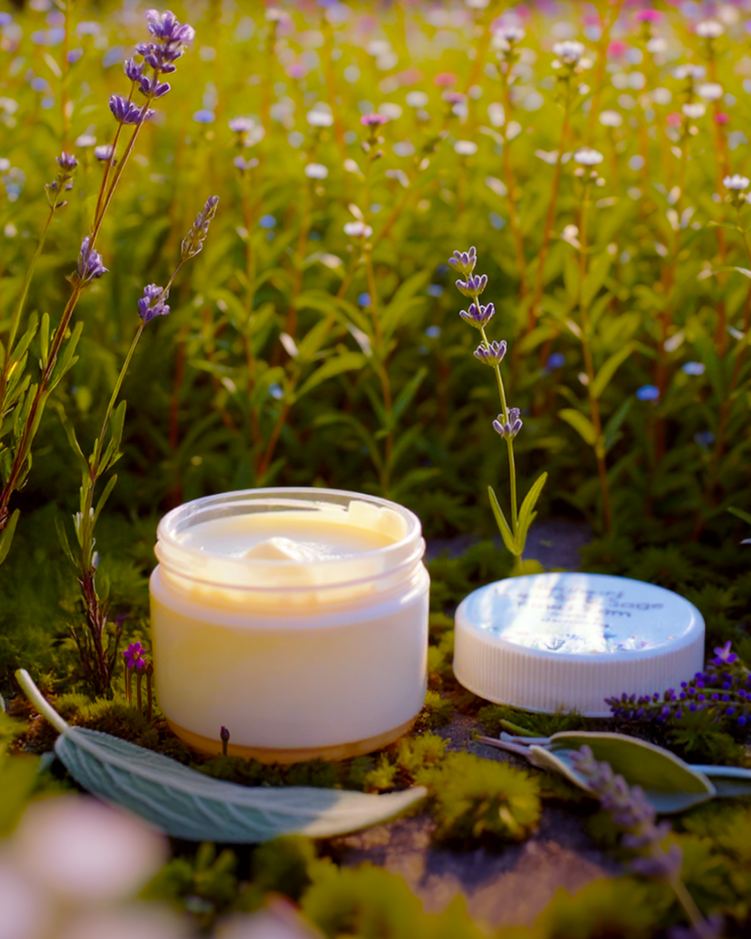
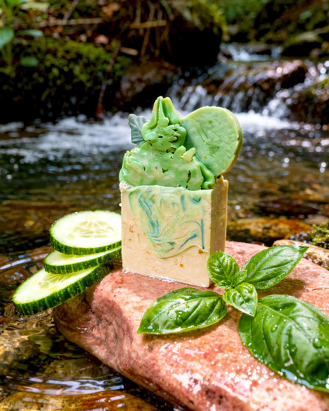
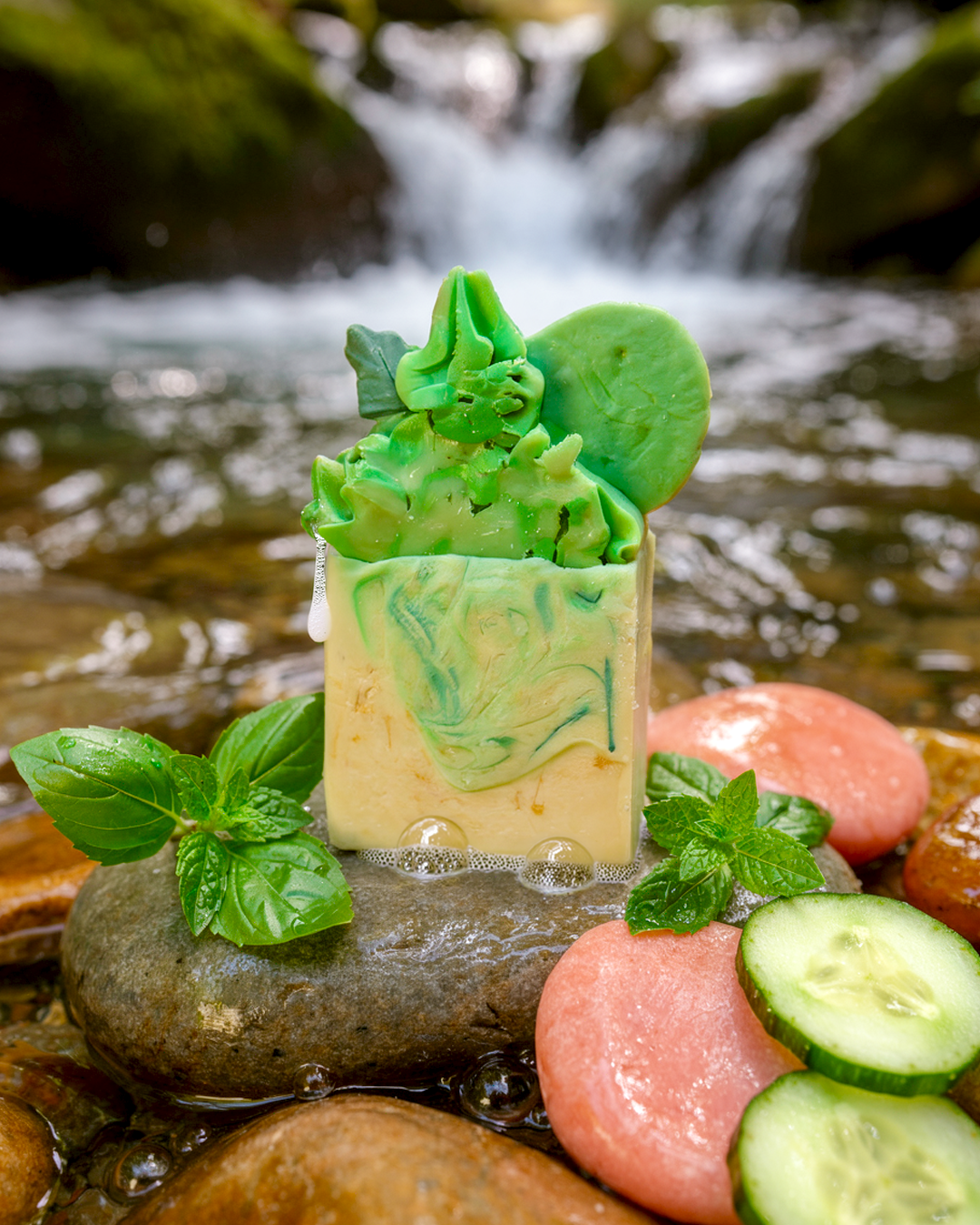
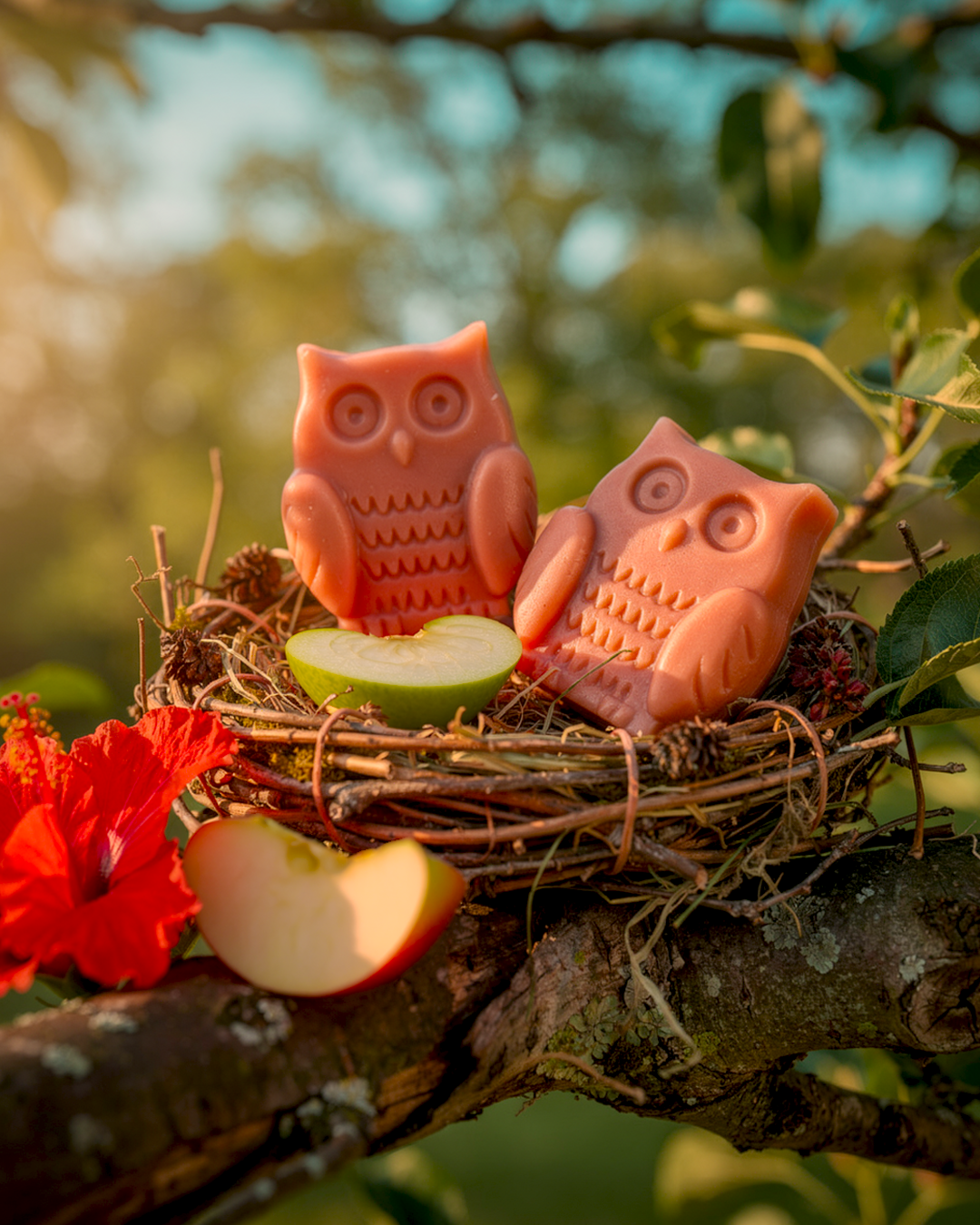
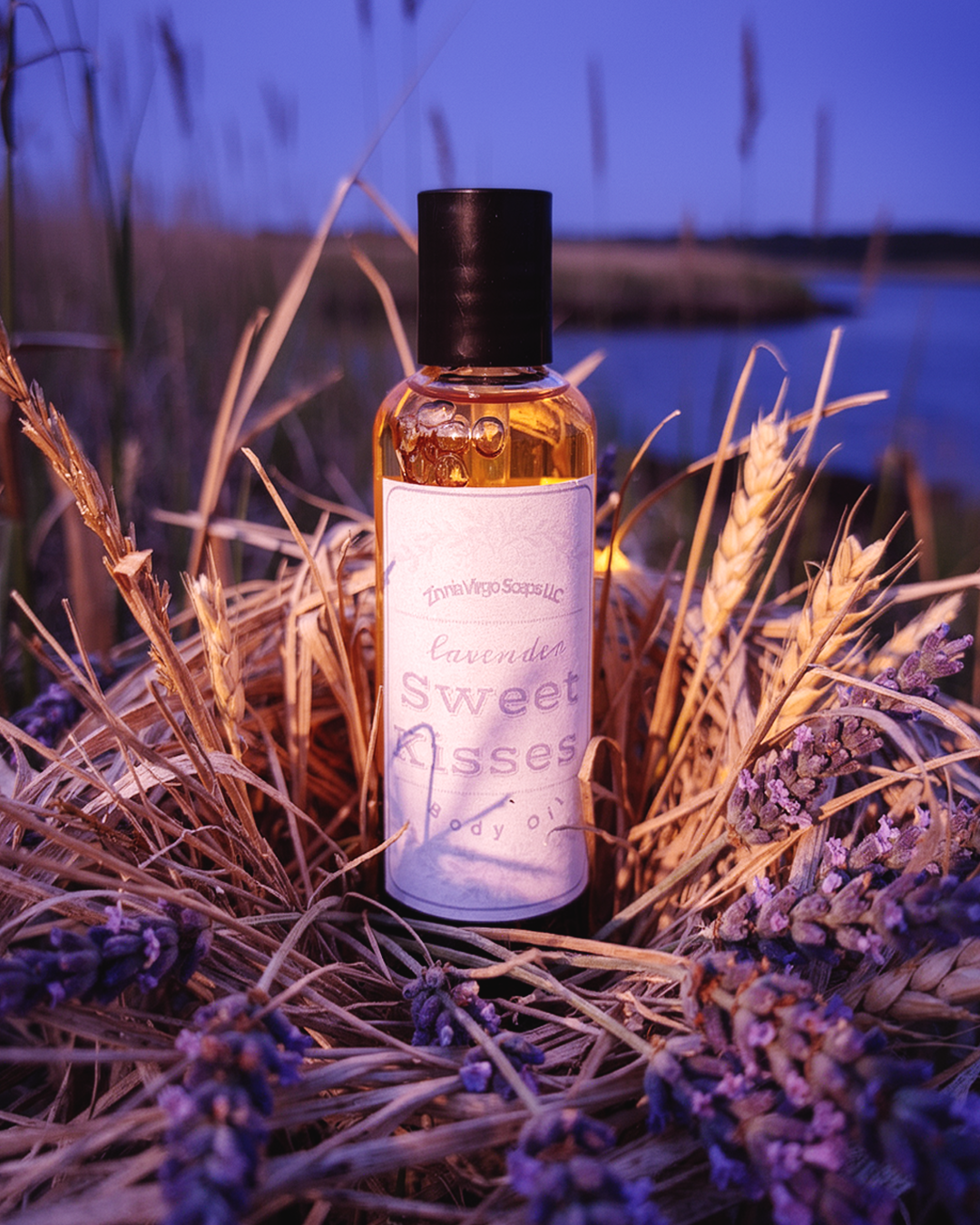
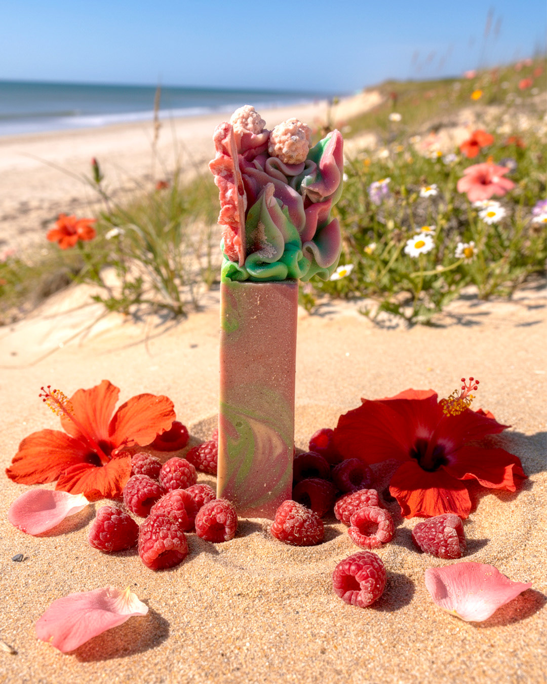
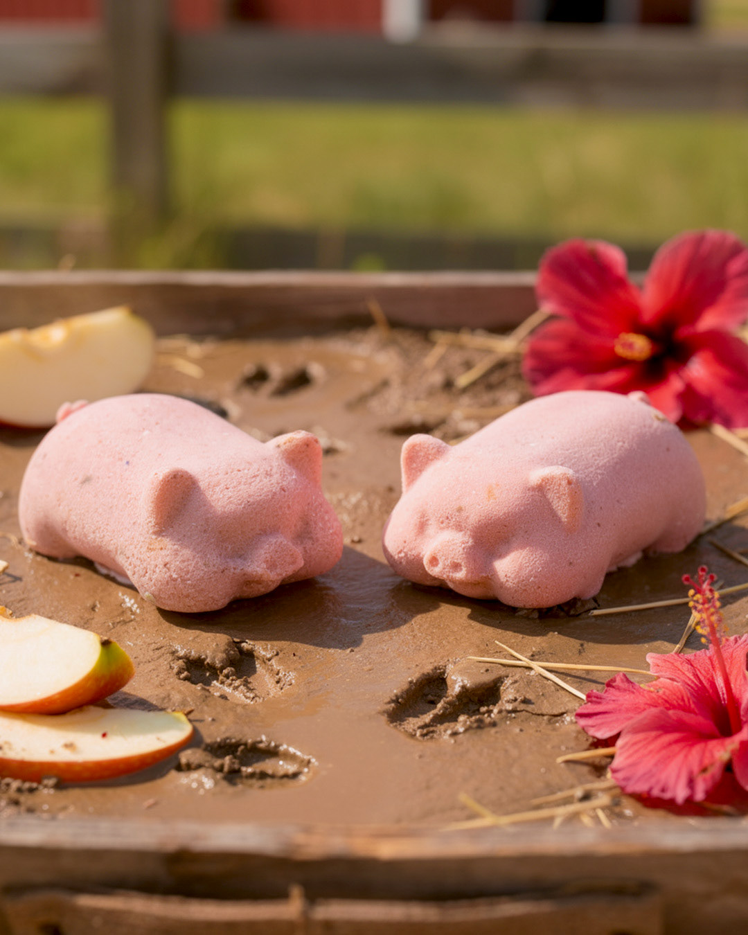
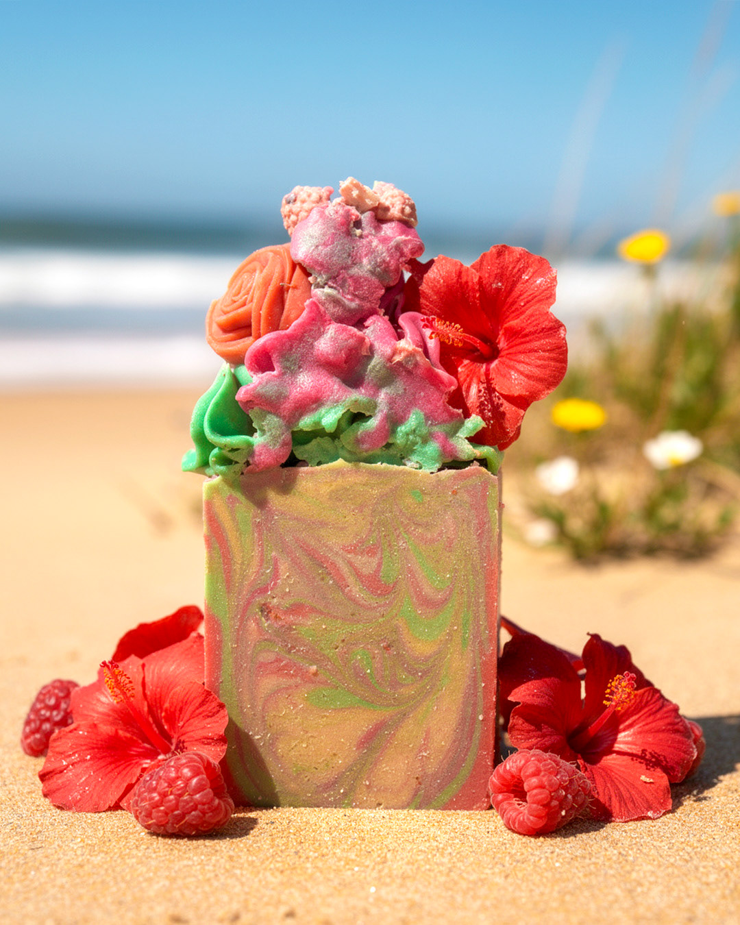
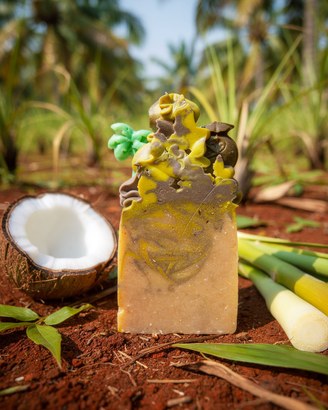
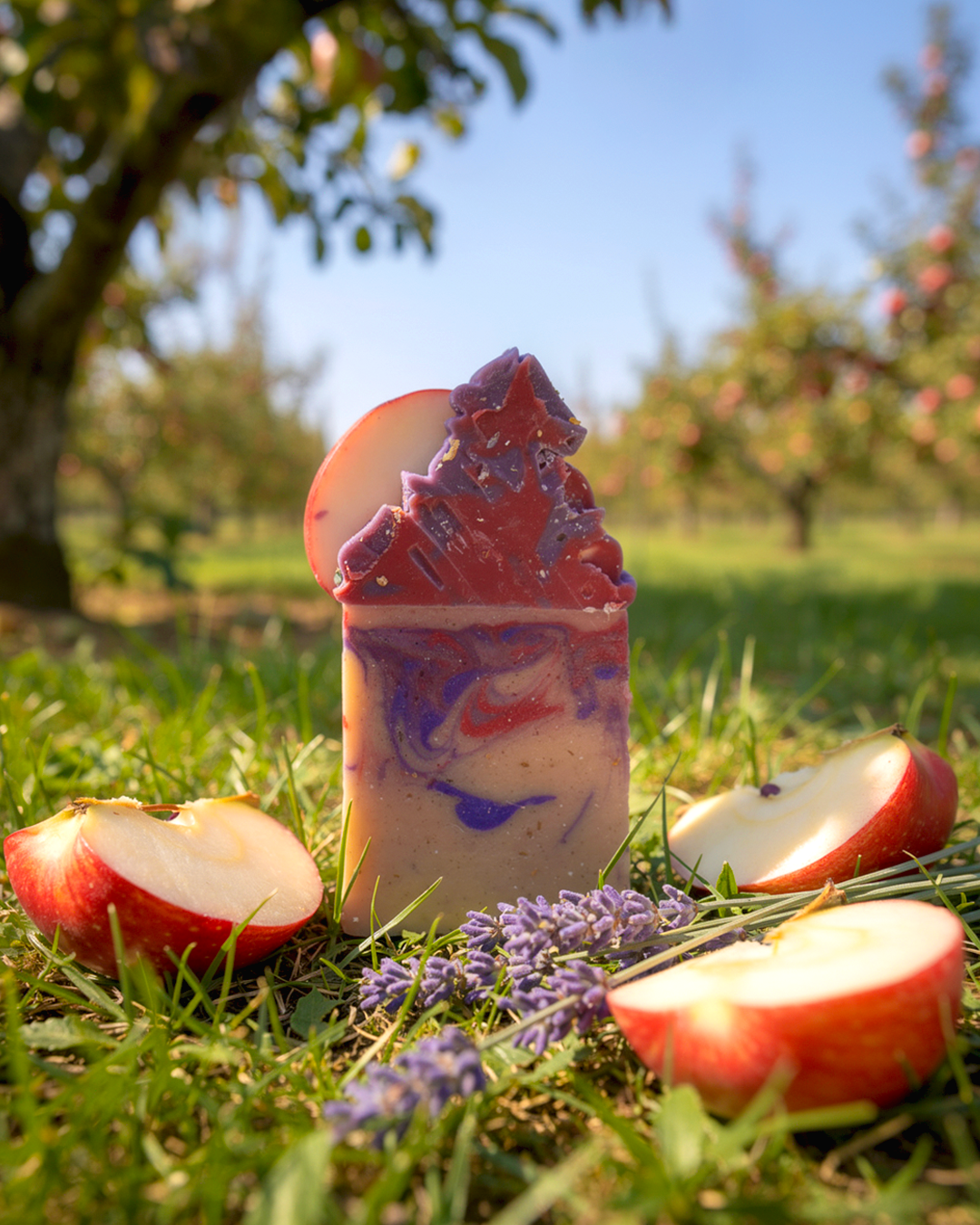
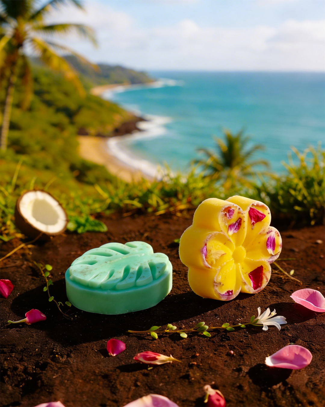
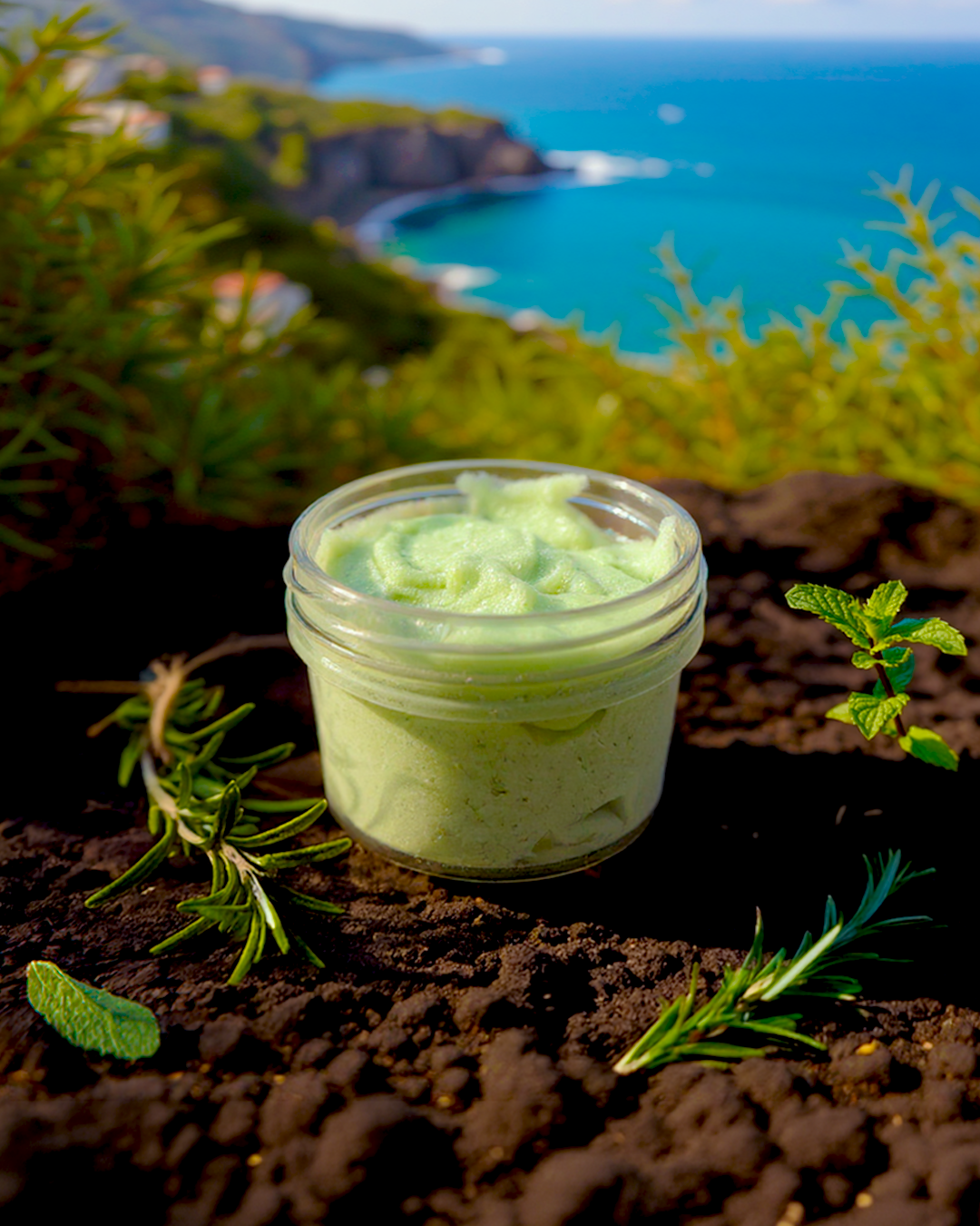
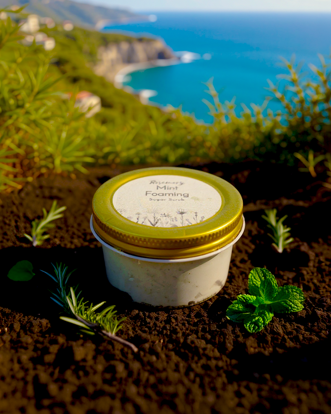
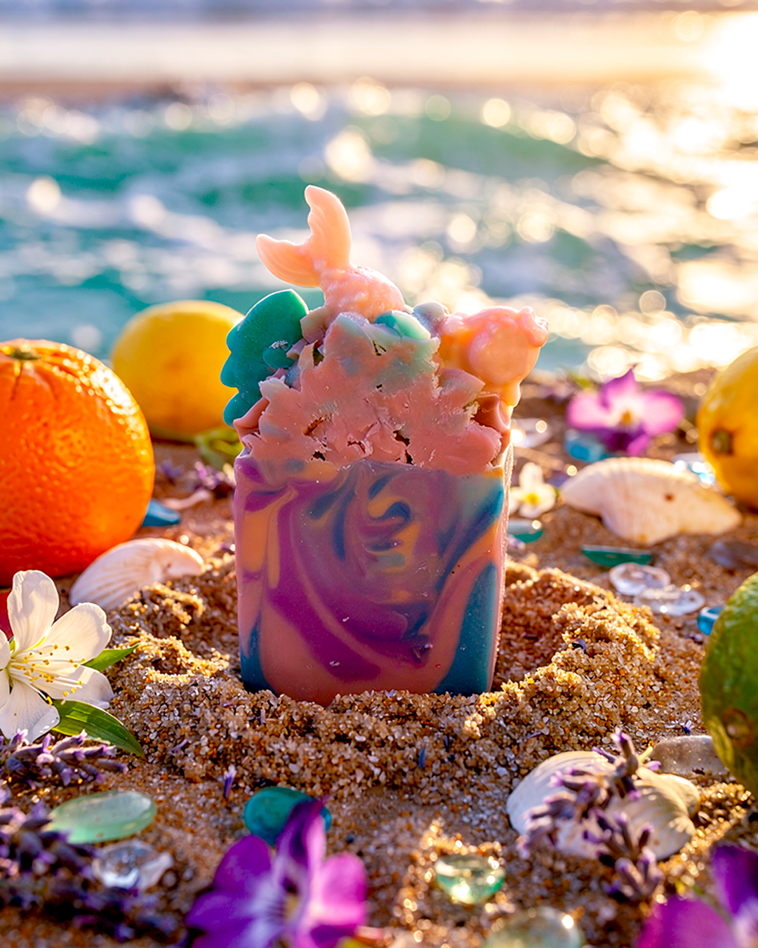
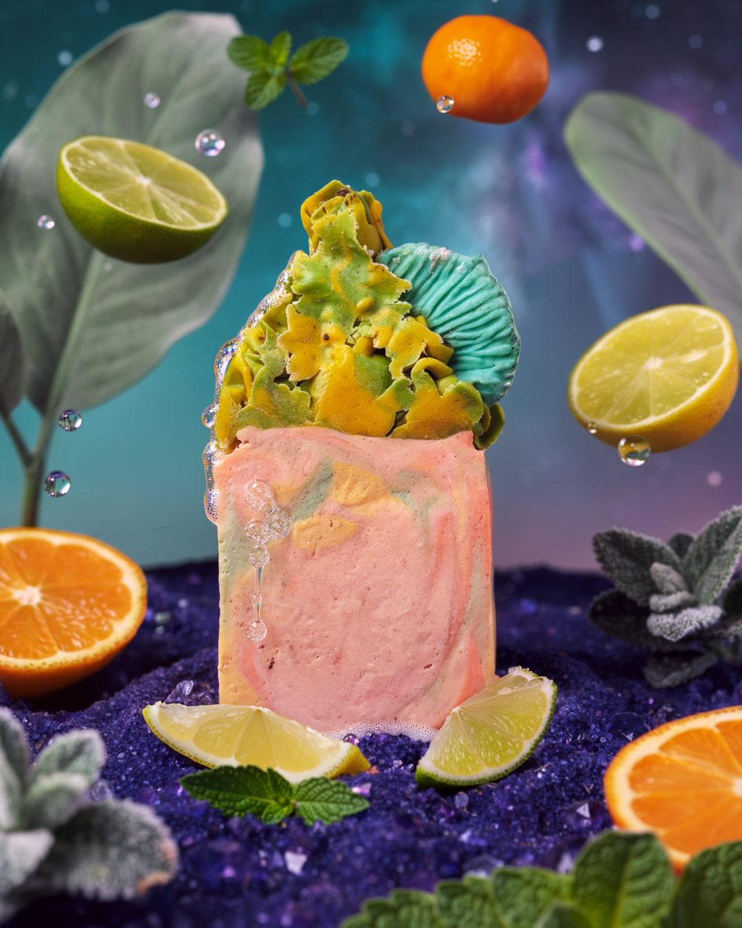
Re-branded visuals of products:
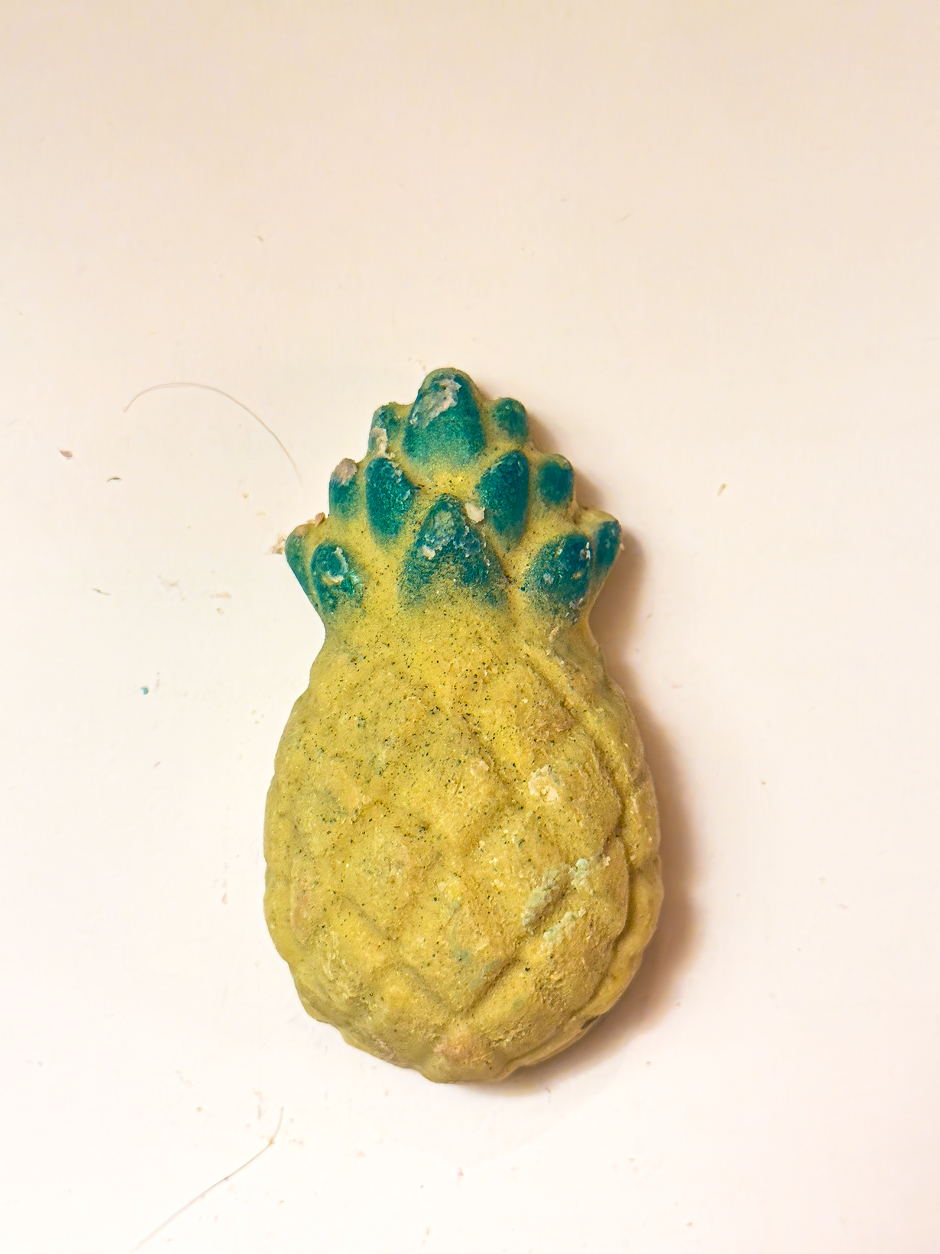
Before I redesigned the graphic

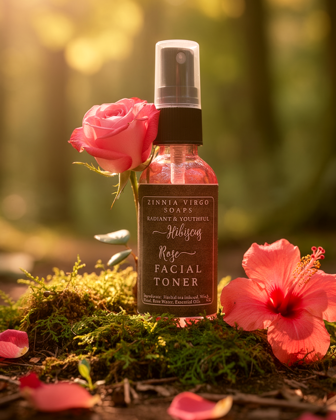
After I redesigned the graphic

After I redesigned the graphic
Before I redesigned the graphic
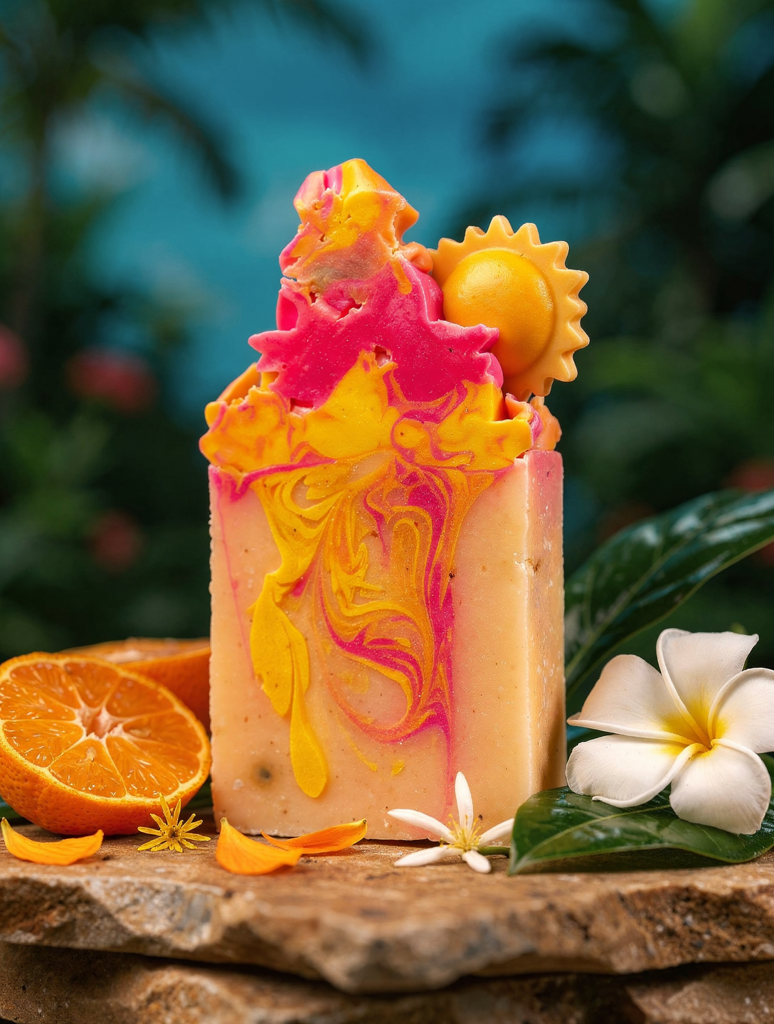
After I redesigned the graphic
After I redesigned the graphic
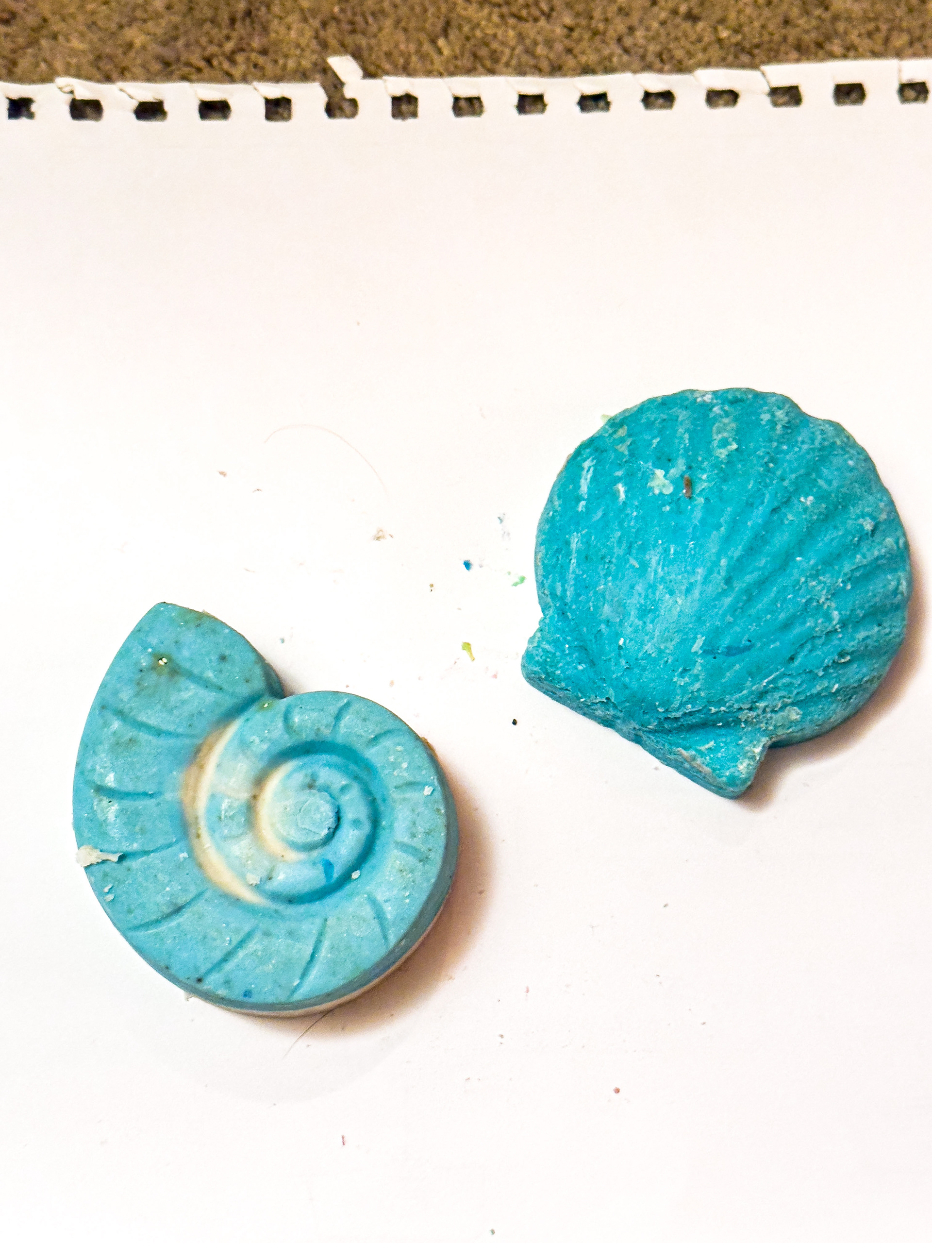
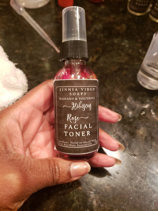
Before I redesigned the graphic

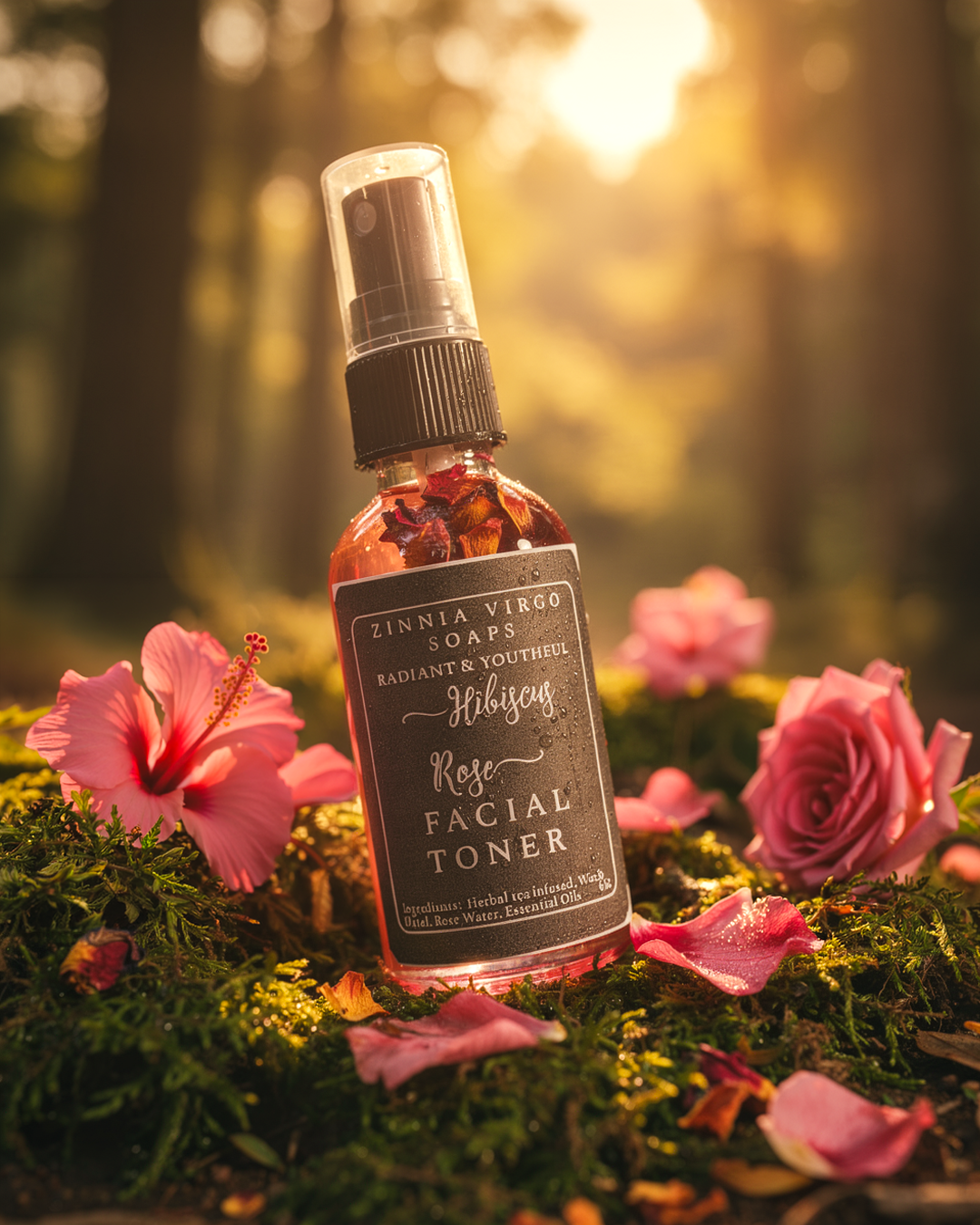
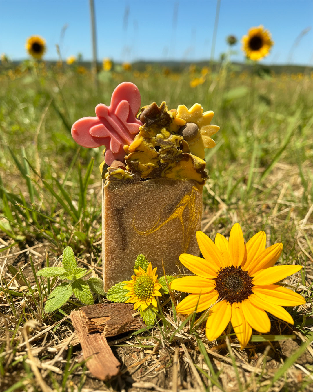
After I redesigned the graphic

After I redesigned the graphic


•
Zinnia Virgo Soaps LLC, a community rooted skincare brand founded by Tebonye Crawford, sought to elevate its presence into a cohesive, luxury leaning system that could scale without losing its warm and transparent personality. To ensure the physical products remained the focal point, the project established a comprehensive brand framework that defined the mission, messaging, and audience profiles, alongside a distinct visual direction described as southern warmth meeting wellness intelligence. This strategic approach informed the creation of adaptable layout templates, detailed photography guidelines favoring bright natural lighting, and a complete website redesign that included rewritten copy for thirty products. Ultimately, the effort successfully repositioned the business into an intentional and unified customer experience that exceeded the expectations of the founders and set a strong foundation for future growth.